Bulletproof buttons for email exist for one reason: a normal styled <a> can half-collapse in Outlook. Outlook on Windows uses Word to render email, so padding, line-height, and border-radius on anchors do not behave like they do in browsers, which is why the button can shrink down to just the text and leave only the label clickable.
The fix is a dual pattern: VML for Outlook, plus a live <a> for every other client. Below, you’ll get the exact copy-paste structure, the design rules that keep it stable, and the common mistakes that break it.
The Bulletproof Button Pattern at a Glance
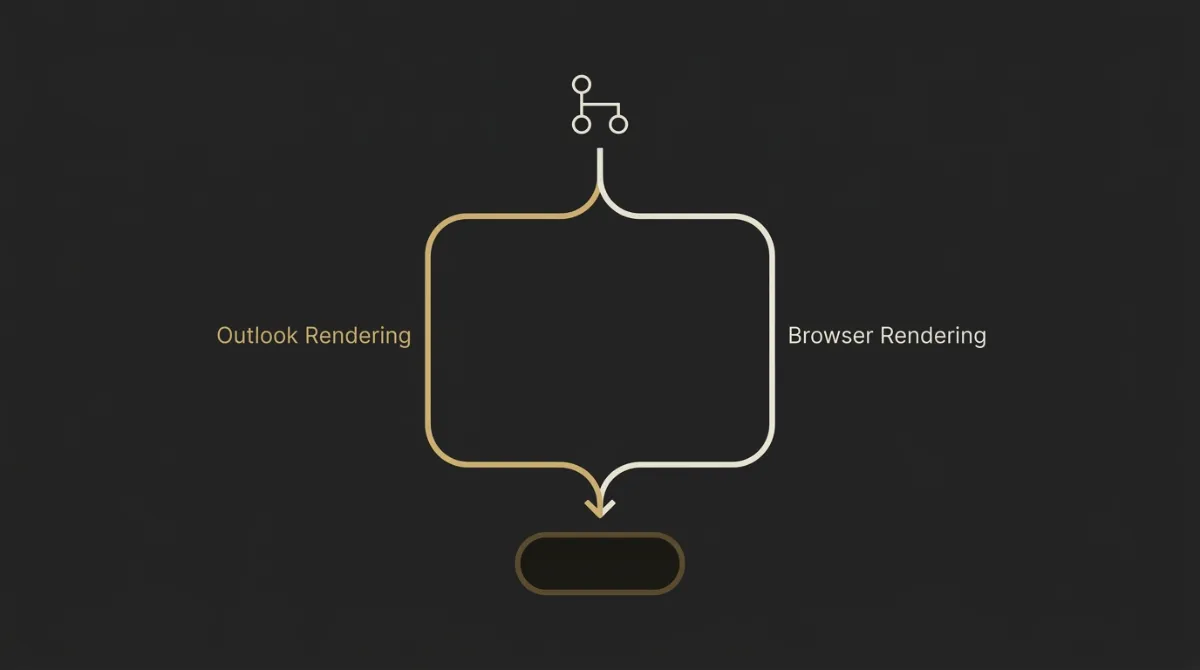
Render the button twice: VML for Outlook, live HTML for everyone else. If you also put the button background color on the wrapping HTML email structure <td>, the CTA holds together more reliably across Outlook and dark-mode recoloring.
Why Outlook breaks plain buttons
Outlook on Windows uses Microsoft Word’s rendering engine, not a browser engine. That is why plain <a> styling can fall apart there: padding, line-height, and border-radius on the anchor do not render reliably, so you can end up with a ghost button where only the text is truly clickable.
This is the core failure bulletproof buttons are solving. The visual box may look close enough, but the hit area is wrong.
The fix in one line
Render every standalone CTA twice: a VML <v:roundrect> inside an [if mso] conditional for Outlook, plus a live <a> inside [if !mso] for every other client, with the background color also set on the parent <td>.
Copy-Paste Bulletproof Button Code
Use the fixed-width version when you need the button to stay the same width across clients and labels.
Fixed-width button
<table role="presentation" border="0" cellspacing="0" cellpadding="0" align="center">
  <tr>
    <td align="center" bgcolor="#111111" style="background-color:#111111;border-radius:8px;">
      <!--[if mso]>
      <v:roundrect xmlns:v="urn:schemas-microsoft-com:vml" xmlns:w="urn:schemas-microsoft-com:office:word"
        href="https://example.com"
        style="height:48px;v-text-anchor:middle;width:220px;"
        arcsize="17%"
        fillcolor="#111111"
        strokecolor="#111111">
        <w:anchorlock/>
        <center style="color:#ffffff;font-family:Arial,Helvetica,sans-serif;font-size:16px;font-weight:bold;">
          Get started
        </center>
      </v:roundrect>
      <![endif]-->

      <!--[if !mso]><!-- -->
      <a href="https://example.com" target="_blank"
        style="background-color:#111111;border-radius:8px;color:#ffffff;display:inline-block;font-family:Arial,Helvetica,sans-serif;font-size:16px;font-weight:bold;line-height:48px;text-align:center;text-decoration:none;width:220px;-webkit-text-size-adjust:none;mso-hide:all;">
        Get started
      </a>
      <!--<![endif]-->
    </td>
  </tr>
</table>
Use the auto-width version when the label length may change and you want the button to grow naturally outside Outlook.
Auto-width (padding-based) button
<table role="presentation" border="0" cellspacing="0" cellpadding="0" align="center">
  <tr>
    <td align="center" bgcolor="#111111" style="background-color:#111111;border-radius:8px;">
      <!--[if mso]>
      <v:roundrect xmlns:v="urn:schemas-microsoft-com:vml" xmlns:w="urn:schemas-microsoft-com:office:word"
        href="https://example.com"
        style="height:48px;v-text-anchor:middle;width:220px;"
        arcsize="17%"
        fillcolor="#111111"
        strokecolor="#111111">
        <w:anchorlock/>
        <center style="color:#ffffff;font-family:Arial,Helvetica,sans-serif;font-size:16px;font-weight:bold;">
          View details
        </center>
      </v:roundrect>
      <![endif]-->

      <!--[if !mso]><!-- -->
      <a href="https://example.com" target="_blank"
        style="background-color:#111111;border-radius:8px;color:#ffffff;display:inline-block;font-family:Arial,Helvetica,sans-serif;font-size:16px;font-weight:bold;line-height:48px;text-align:center;text-decoration:none;padding:0 24px;-webkit-text-size-adjust:none;mso-hide:all;">
        View details
      </a>
      <!--<![endif]-->
    </td>
  </tr>
</table>
How the Pattern Works, Line by Line
This pattern is simple once you see the job of each layer. One part is there for Outlook, one part is there for every other client, and the wrapper keeps the button visually intact when rendering gets messy.
The wrapper table and bgcolor on the td
The outer table is there because email layout still lives on tables, not modern CSS layout. You want role="presentation" so screen readers do not treat the structure as tabular data.
The <td> is doing more than centering. It carries the fallback button color with both bgcolor and inline background-color, which matters when Outlook ignores parts of anchor styling or when dark-mode recoloring changes how the inner layer is painted.
In practice, this means the button can keep a solid visual block even if the anchor background is not fully respected. It also reduces seam issues around the edges, which is why this pattern is more stable than styling the <a> alone.
The VML roundrect for Outlook
The <v:roundrect> block exists only for Outlook on Windows. Word can render that shape, which is why it can give you corners and a filled button box that plain CSS on an anchor cannot reliably produce there.
arcsize controls the corner rounding. In most email builds, a range around 8% to 17% is enough to get visibly rounded corners without pushing into a pill shape.
fillcolor sets the button fill, and strokecolor sets the border color. If you want no visible border, you still usually keep the stroke color matched to the fill so the shape stays clean.
<w:anchorlock/> is the small but important piece that locks the link behavior to the full VML shape. Without it, you are much closer to the classic Outlook failure where the text feels clickable but the box does not.
The inner <center> handles the label styling for Outlook. That is where you set the font family, size, weight, and text color Word will actually use inside the button.
The live anchor for every other client
The live <a> is the real button for non-Outlook clients. It is hidden from Outlook with the non-MSO conditional, so you are not asking Word and the browser-style clients to render the same layer.
display:inline-block is what makes the anchor behave like a box instead of plain inline text. From there, you size it one of two ways: fixed width plus line-height, or horizontal padding plus line-height.
line-height:48px is doing the vertical centering work in the fixed-height pattern. That gives you a clean hit area without relying on padding values that Outlook may interpret differently.
If you need a fixed button, use an explicit width. If you need the label to grow naturally, use horizontal padding on the anchor, but remember Outlook still needs a defined VML width on its side.
The result is two render paths for one CTA. Outlook gets a shape Word understands, everyone else gets a normal anchor, and the wrapper <td> keeps the color block stable underneath both.
Button Design Rules That Make Them Convert
A bulletproof button only works if the design spec is dialed in too. The matrix below keeps the button easy to tap, visually clear, and disciplined inside the layout.
| Spec | Recommended value | Why it matters |
|---|---|---|
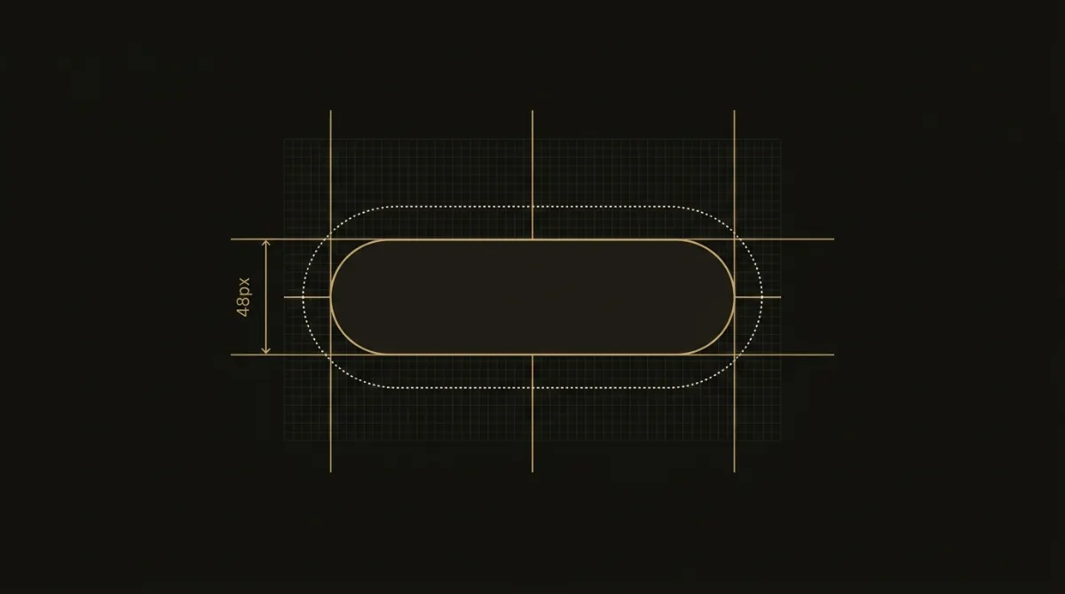
| Minimum height | 48px | Keeps the CTA large enough to read and click comfortably. |
| Padding | 16px vertical / 32px horizontal | Gives the label breathing room without making the button feel bloated. |
| Border-radius | 8px or pill 999px | Creates a clear button shape while staying easy for Outlook VML to mirror. |
| Font size / weight | 15–16px at 600 weight | Improves scanability and keeps the label visually strong inside the shape. |
| Touch target | 44×44px minimum | Protects tap accuracy on mobile screens. |
| Buttons per zone | One primary button per zone | Prevents CTA competition and keeps the next action obvious. |
A standalone CTA is always a bulletproof button; a Learn more → link inside copy stays a styled text link, never a button.
Bulletproof Button Support Across Email Clients
The VML-plus-anchor pattern is the practical standard because it stays functional across the major inboxes people actually use. What changes client to client is not whether the CTA works, but how much of the styling is native CSS versus Outlook-specific fallback.
| Email Client | Renders | Rounded corners | Fully clickable | Note |
|---|---|---|---|---|
| Apple Mail | Yes | Yes | Yes | Uses the live anchor as intended. |
| Gmail (web + app) | Yes | Yes | Yes | Functional with the live anchor; watch dark-mode inversion. |
| Outlook for Windows (classic) | Yes | Yes | Yes | The VML shape preserves the box, corners, and full hit area where CSS-only buttons would degrade. |
| Outlook for Mac | Yes | Yes | Yes | Relies on the live anchor rather than the Word-engine fallback. |
| Outlook.com / 365 webmail | Yes | Generally yes | Yes | Functional, but webmail color handling can shift in dark mode. |
| Yahoo | Yes | Yes | Yes | Uses the non-Outlook anchor path. |
| iPhone/iPad | Yes | Yes | Yes | Good fit for the live anchor, especially with a solid touch target. |
Where it renders perfectly
For most modern clients, the button renders off the live <a> and behaves like a normal styled CTA. Apple Mail, Gmail, Yahoo, Outlook for Mac, and iPhone/iPad are the easy path here.
Classic Outlook for Windows is the special case, but this is exactly what the pattern is for. Instead of losing corners and shrinking the click area the way a CSS-only button can, it swaps to the VML shape and keeps the button usable.
Dark mode behavior
Gmail and Outlook.com can invert button colors in dark mode, so this is where small markup decisions matter. Setting the background twice, once with bgcolor and once with inline background-color, gives recoloring clients two chances to preserve the fill.
About a third of measurable email opens happen in dark mode, so this is not edge-case work anymore. If the button color is especially important, keep the wrapper color stable and test the live anchor treatment in both light and dark inboxes.
Common Bulletproof Button Mistakes and Fixes
Forgetting bgcolor on the td
If the wrapper cell has no bgcolor, the button can lose its fill when the anchor background is ignored or a client recolors the button in dark mode. Set the color on the <td> with both bgcolor and inline background-color, not just on the <a>.
Mismatched VML and anchor width
If the VML shape is much wider or narrower than the live <a>, Outlook will show a different button than every other client. Keep them roughly matched, and if you need a default fixed width, stay in a sensible range like 200 to 240px.
Using a button for an inline link
A CTA on its own line should be a bulletproof button. A Learn more → link inside a paragraph or content block should stay a styled text link, otherwise the layout gets heavy and the CTA hierarchy starts to break.
Only the text is clickable
If only the label is clickable, the anchor is usually still acting like inline text instead of a box. Set the <a> to display:inline-block (or block where appropriate), make sure it is not nested inside another <a>, and keep -webkit-text-size-adjust:none plus text-decoration:none on the button link.
Why Image Buttons Are Not Bulletproof
An image-only button is the one thing that can look identical everywhere, as long as images load. But the moment a client blocks images, the CTA can disappear into an empty box or a missing graphic, and screen readers do not get clean live button text from that image, so it is not actually bulletproof.
A code-based button keeps the label as live HTML, which means the CTA still shows with images off and stays editable without exporting a new graphic every time the copy changes. Keep the text-to-background contrast at 4.5:1 or better, and do not bake button copy into images if you want the result to stay accessible and resilient.
Get Bulletproof Buttons in Every Email Automatically
Paste the dual-render pattern, set bgcolor on the <td>, keep the VML width aligned with the live <a>, and use buttons only for standalone CTAs, not inline links. If you would rather not hand-code a VML conditional on every send, EmailTemple emits this exact Outlook-safe, dark-mode-safe button on every standalone CTA: describe the email, export production-ready HTML, and Generate your branded template for free.
Frequently Asked Questions
What makes an email button bulletproof?
A bulletproof email button is a code-based button built with live text and fallback markup so it keeps rendering and stays clickable across email clients. It still works when images are off, which is exactly why it is more reliable than an image CTA.
Why does my button only have clickable text in Outlook?
This usually happens because classic Outlook uses Word’s rendering engine and does not respect normal anchor padding the way webmail and Apple Mail do. The VML <v:roundrect> plus <w:anchorlock/> fixes that by turning the full shape into the clickable area.
Do bulletproof buttons keep rounded corners in Outlook?
Yes, if you use the VML shape for Outlook. The arcsize setting draws the rounded corners in classic Outlook, while a CSS-only button typically loses them there.
Can email link tracking break with VML buttons?
Yes, it can if the URL in the VML href and the URL in the live <a> do not match. Some ESPs read the tracking target from the VML side, so update both links every time or you can end up with broken tracking or the wrong destination.
How wide should a bulletproof button be?
A fixed width around 200 to 240px is a practical default for many buttons. The main rule is consistency: if the VML version is 220px wide, the live anchor should be roughly the same width too.
Are bulletproof buttons dark-mode safe?
They can be, but only if you code for it directly. Set the background twice, with bgcolor on the wrapper cell and inline background-color, use solid brand colors with strong contrast, and remember that about a third of measurable opens happen in dark mode now.