If your layout depends on it, that CSS has to live inline, not in a <style> block. That’s the entire doctrine of inline CSS in email in one sentence: webmail clients strip embedded stylesheets often enough that any style your design can’t survive without (font size, color, spacing, layout) must be written as a style="" attribute on the element itself. Everything else, media queries, dark-mode overrides, hover states, can sit in a <style> block as a bonus layer, because if it gets stripped, the email still holds together.
This is written for the person actually building the template: developers coding an HTML email by hand, and small business owners or operators assembling one in their ESP who keep watching their layouts break on send. If you’ve ever wondered why a perfectly good <style> block renders fine in your inbox preview and then falls apart the moment a subscriber opens it in Gmail, this is the gap you’re closing.
The 9 rules below are ordered by how load-bearing they are, not by workflow convenience. The first rules cover what breaks the email outright if you get them wrong; the last rules cover process and edge cases you’ll hit less often. Most guides on inlining CSS in email show you how to run an inliner tool. Few state the actual doctrine: which specific styles must survive a stripped <style> block for the email to still render as designed, and which ones are safe to leave as progressive enhancement. That distinction is the backbone of every rule that follows. For the underlying rendering logic these rules are built on, see our email rendering doctrine.
TL;DR: What to Inline and What to Leave in Style
Every load-bearing style, font size, weight, color, line-height, layout, has to sit inline in a style="" attribute; a <style> block is progressive enhancement only, never the foundation.
- For core typography and layout: inline every style. Font size, weight, color, line-height, and table/cell dimensions all go inline, no exceptions.
- For responsive stacking: keep media queries in
<style>, but give every element an inline fluid fallback (width="100%"plusmax-width:600px) so the layout still shrinks to fit even if the media query never fires. - For dark mode and hover states: these live in
<style>as overrides, always paired with an inline fallback color so a stripped stylesheet doesn’t leave text unreadable. - For workflow: build inline-first, layer media queries and dark-mode overrides last, and never depend on your ESP’s auto-inliner to catch what you didn’t write inline yourself.
The reasoning behind this split comes down to what a stripped <style> block takes with it: your layout and your type, if you didn’t inline them, and nothing else, if you did. For the full breakdown of how each rendering decision maps to a specific client behavior, see whether AI can write HTML email.
How We Evaluated These Inline CSS Rules
Each rule below gets judged against the same five criteria, not picked because it sounds like good practice. These are the questions we ask of every inline-CSS decision before it earns a spot on the list.
Client compatibility
Does the rule hold up across Gmail webmail, Outlook’s Word-based rendering engine, Apple Mail, and the major mobile clients, not just the one inbox you happened to test in. A rule that looks fine in Apple Mail but collapses in Outlook doesn’t qualify as bulletproof.
Survives style-block stripping
Does the layout and typography still hold if the entire <style> block gets removed from the document. This is the sharpest test in the set: if a style only works because the <style> block was left intact, it was never load-bearing in the first place.
Responsive fallback quality
Does the design still work on a narrow viewport if the media query never fires. A responsive rule that depends entirely on <style>-block media queries is a bet, not a fallback.
Dark-mode safety
Does text and background stay legible once a client forces recoloring, whether that’s a partial invert or a full one. Rules get penalized here if they only look right under one specific dark-mode behavior instead of all three documented rendering modes.
Maintainability
What does it cost to author and update the rule over time, since heavier inline markup is harder to hand-edit than a clean <style> block. A rule that’s bulletproof but unreadable six months later still has a real cost, even if it never breaks in a client.
These five criteria repeat across every rule in this list, so once you’ve read the case for one, you’ll recognize the same test being applied to the next.
This table lines up all 9 rules on the same four dimensions so you can scan the full set before reading the reasoning behind each one. Use it as a reference while building or auditing a template, then jump to the entry below for the rule you need to dig into.
| Rule | What it governs | Inline or <style> | Survives stripped <style>? | Main failure if ignored |
|---|---|---|---|---|
| 1. Inline all load-bearing styles | Typography, color, layout | Inline | Yes | Layout collapses entirely |
| 2. Fluid 600px backbone | Width and shrink behavior | Inline | Yes | Horizontal scroll, overflow |
| 3. Media queries with fallback | Column stacking, mobile type | <style> + inline fallback | Fallback only | Desktop layout stuck on mobile |
| 4. Dark-mode overrides with fallback | Recolored backgrounds/text | <style> + inline fallback | Fallback only | Unreadable text on invert |
| 5. Hover/keyframe/pseudo styles | Micro-interactions, motion | <style> only | No | Effect silently disappears |
| 6. Outlook-safe styles (VML buttons) | Button rendering, corners | Inline + VML conditional | Yes | Square, broken buttons |
| 7. Inline-first, media queries last | Build sequence/workflow | Process rule | Yes (by design) | Responsive-only styles ship undefended |
| 8. Don’t rely on ESP auto-inliners | Export/QA responsibility | Process rule | Yes (if followed) | Silent gaps in coverage |
| 9. Avoid <style>-selector core typography | Anti-pattern check | Inline (enforced) | Yes | Fonts/colors vanish on strip |
1. Inline Every Load-Bearing Style
Overview
Any CSS your layout depends on must live in an inline style="" attribute, not a <style> block selector.
Font size, font weight, color, line-height, and layout dimensions are all load-bearing: if the email breaks visually without them, they’re load-bearing, and they go inline. This isn’t a stylistic preference, it’s a survival requirement, because Outlook, Gmail, and a long list of other clients strip embedded stylesheets in enough real-world scenarios that anything routed through a selector is a coin flip. EmailTemple’s own design spec treats this as a non-negotiable: font size, weight, color, and line-height are set as inline attributes on every generation, with <style> reserved for dark-mode overrides and hover states, both of which still carry an inline fallback underneath.
Best for: anyone shipping transactional or marketing email that has to render identically whether it lands in Apple Mail, Gmail webmail, or Outlook’s Word engine.
Key points
- What counts as load-bearing: font size, font weight, text color, line-height, background color, padding, and table/cell widths, anything the layout or readability depends on.
- Why selectors fail: a
<style>block only works if the client renders it, and enough clients strip it in enough contexts (non-primary Gmail accounts, oversized blocks, certain mobile apps) that betting on it is a bad trade. - The inline pattern: write the property directly on the element,
style="font-size:16px; color:#1A1A1A; line-height:1.5;", rather than defining a class and referencing it. - The
<style>exception: media queries, dark-mode overrides, and hover/keyframe effects are the only things that belong in a<style>block, and only when paired with an inline fallback that holds the fort if the block gets dropped.
Strengths
- Renders consistently across Gmail, Outlook, Apple Mail, and mobile clients without depending on any one engine’s CSS support.
- Survives a fully stripped
<style>block, since nothing critical was ever routed through it. - Produces predictable output: what you write on the element is what renders, with no cascade or specificity surprises.
Weaknesses
- Markup gets verbose fast, repeating the same style string across dozens of elements instead of defining it once.
- Hand-editing is harder to manage than a clean stylesheet, since a global change (like a brand color update) means touching every instance instead of one rule.
Who it’s for
This is the baseline rule for anyone hand-coding or reviewing an HTML email meant to survive real-world inboxes, not just a browser preview. If you’re a small business operator building templates yourself or checking what an ESP’s default template gave you, this is the first thing to verify before anything else on this list.
2. Build a Fluid 600px Backbone That Survives Stripping
Overview
The fluid 600px backbone is the structural fallback that holds the layout together even when the entire <style> block gets stripped out.
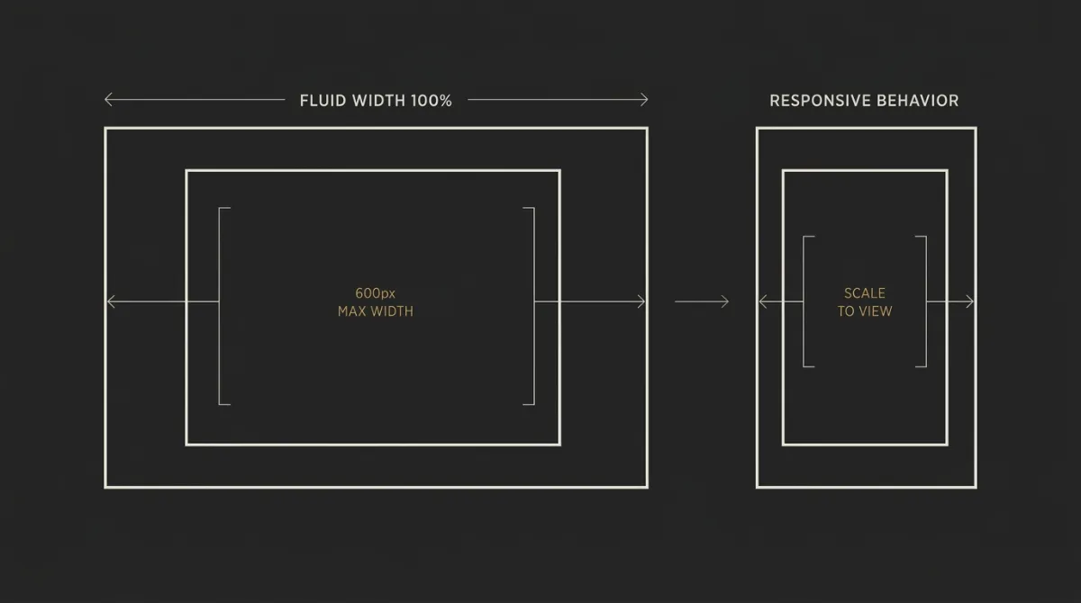
The pattern: an outer table set to width="100%" as an HTML attribute centers the email, while the body container caps at 600px using max-width:600px as an inline style, never a fixed width="600". Because width="100%" lets the container shrink and max-width:600px sets its ceiling, the email shrink-fits any viewport from 320px upward without needing a single media query to fire. Every nested table inside follows the same rule, width="100%", never a fixed pixel value, so the whole structure scales together instead of one rigid piece breaking the rest.
Best for: anyone building the outer container and nested tables of an email template that has to survive both a stripped <style> block and a narrow mobile viewport.
Key points
- Why fixed widths overflow: a hardcoded
width="600"orstyle="width:600px"forces exactly 600px regardless of the screen, so it overflows any viewport narrower than that and forces horizontal scrolling. - Why the HTML attribute matters:
width="100%"as an attribute (not just a CSS property) gives Outlook and other stubborn renderers something to grab onto even when inline styles alone would be ignored. - Why nested tables inherit the rule: every table inside the body container also uses
width="100%", so a single fixed-width child can’t undo the fluid behavior of its parent. - Why this needs zero media queries: the shrink-fit behavior comes from the width/max-width pairing alone, which means it works identically whether or not the
<style>block (and its media queries) survives the client.
Strengths
- Holds the layout together on 320px-wide screens without depending on any responsive CSS actually loading.
- Gives Outlook, Gmail, and mobile clients a consistent baseline to render against, since the fallback lives in HTML attributes, not selectors.
- Pairs cleanly with media queries later (see the next rule), since the backbone is the foundation those queries enhance, not the thing they create.
Weaknesses
- Requires nested table markup throughout the template, which reads as more verbose than a single flexible container would in modern web CSS.
- Every new table added to the template has to remember the same
width="100%"convention, or it becomes the one element that breaks the shrink-fit.
Who it’s for
This is core structural work for anyone coding the outer shell of an email template, not just a nice-to-have refinement. If you’re auditing a template an ESP or a contractor built for you, checking whether the body container uses max-width:600px instead of a fixed width="600" is one of the fastest ways to spot whether it was actually built to survive real inboxes.
3. Keep Media Queries in Style With an Inline Fallback
Overview
Media queries can only live in a <style> block by definition, so they have to layer on top of an already-correct inline layout, never carry weight the layout can’t survive without.
By nature, a @media rule can’t be written as an inline style="" attribute, it only works as a selector inside <style>. That means every column-stacking rule, every mobile type reduction, has to assume the block containing it might not render at all. The inline fluid backbone from the previous rule is what the email falls back to if that happens; the media query is the polish on top, not the mechanism holding the layout together.
Best for: anyone writing the responsive layer of a template, after the inline fluid structure is already in place.
Key points
- Stripping isn’t universal, but it’s real: Gmail webmail and several mobile clients strip
<style>blocks in specific contexts (non-primary Gmail accounts, CSS syntax errors, blocks over roughly 8KB), not as a blanket rule, but often enough that a media query can’t be trusted to fire every time. - Column-stacking is enhancement, not foundation: the
.stackpattern that collapses a two-column row into one on mobile only works if the media query loads; the base layout has to already be usable without it. - Match the breakpoint to the body width: the mobile query should trigger at exactly 600px, matching the body container’s
max-width, so there’s no gap where a narrow desktop window gets mobile styles meant for a 600px layout. - Type reductions are cosmetic, not structural: font-size tweaks for small screens belong here too, since a slightly larger heading on mobile is a readability nuisance, not a broken layout.
Strengths
- Lets the template stack columns and adjust type for mobile without bloating every element with inline media-query workarounds (which don’t exist).
- Degrades gracefully: if the block is stripped, the reader gets the fluid desktop layout scaled down, not a broken one.
- Keeps the responsive layer separate from the load-bearing layer, so updating breakpoints doesn’t risk touching the core inline styles.
Weaknesses
- Media queries genuinely cannot be inlined, so this rule always carries some risk of non-delivery in clients that strip the block.
- Firing is inconsistent enough across clients that you can’t treat the mobile-specific styling as guaranteed, only as a bonus when it lands.
Who it’s for
This is the rule for anyone adding responsive behavior, column stacking, mobile type sizing, to a template that already has its inline fluid backbone in place. Skipping straight to media queries without that foundation is the most common way a “responsive” email still breaks the moment <style> gets stripped.
4. Put Dark-Mode Overrides in Style, Never in the Backbone
Overview
Dark-mode CSS is progressive enhancement by nature, so it belongs in <style>, and the light-mode layout underneath has to be correct and legible entirely on its own, with inline fallbacks that hold if the override never loads.
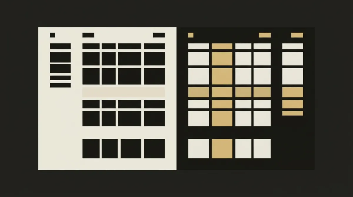
Roughly a third of email opens now happen in dark mode, which puts it well past edge-case territory and into mainstream design concern. The trouble is that clients don’t agree on how to handle it: some leave author colors alone, some apply a partial invert, and some force a full invert of the whole email. A dark-mode override written only for one of those three behaviors will look correct in that one client and broken in the other two, which is exactly why the underlying inline layout needs to survive regardless of which behavior fires.
Best for: anyone finalizing the color and background layer of a template who wants it to stay legible regardless of which of the three dark-mode behaviors a recipient’s client applies.
Key points
- Declare every zone background twice: set both the
bgcolorHTML attribute and an inlinebackground-colorstyle on the same<td>or<table>, since a recoloring client tends to respect one or the other, and duplicating it means the zone seam survives either way. - Avoid pure white and pure black on large surfaces:
#FFFFFFand#000000invert to harsh extremes under forced dark mode, so body text and large backgrounds should sit closer to off-white and near-black instead. - Treat dark mode as mainstream, not an edge case: with roughly a third of opens happening in dark mode, skipping it isn’t a minor omission, it’s ignoring how a meaningful share of your list actually reads your email.
- Design for all three client behaviors, not just one: no recoloring, partial invert, and full invert are all documented outcomes, so an override that only accounts for one is only a third of the way solved.
Strengths
- Keeps zone backgrounds visible and text legible across clients that leave colors alone, partially invert, or fully invert.
- Isolates the dark-mode logic in
<style>, so it can be updated or expanded without touching the load-bearing inline layout. - Scales cleanly: once the double-declaration pattern (
bgcolorplus inlinebackground-color) is established, it repeats the same way across every zone in the template.
Weaknesses
- Doubles the background declarations on every zone, which adds markup even if each individual line is simple.
- If the
<style>block gets stripped, dark-mode readers see the light-mode design as-is, which is acceptable but not the intended treatment, so the light-mode fallback still has to look deliberate on its own.
Who it’s for
This rule matters most for anyone whose subscriber base skews toward Apple Mail or Gmail on mobile, where dark mode adoption is highest. If your emails are still built on the assumption that every inbox renders in light mode, this is the gap most likely to make roughly a third of your opens look unfinished.
5. Keep Hover, Keyframe, and Pseudo Styles Embedded
Overview
Hover states, keyframe animations, and pseudo-selectors can’t be written as inline style="" attributes at all, so they have to persist in a <style> block and get treated as enhancement, never as something the email depends on.
These styles are selector-based by definition: :hover, @keyframes, ::before, ::after only exist as rules attached to a selector, there’s no inline equivalent to fall back on. That makes them fundamentally different from the load-bearing styles in rule 1, which is why they need their own dedicated space in the document rather than getting mixed in with styles meant to be stripped out and inlined by a build step or an ESP’s inliner. If you’re running your CSS through an inlining tool, most let you flag a <style> block to persist untouched (commonly via a data-embed-style attribute), while a separate block gets processed and inlined normally.
Best for: anyone adding a polish layer, a hover effect on a CTA, a subtle keyframe animation, a pseudo-element accent, on top of an email that already works without it.
Key points
- These are inherently selector-based: hover, keyframe, and pseudo styles have no inline equivalent, so “inline everything” doesn’t apply to them, they simply cannot exist outside a
<style>block. - Separate the persist block from the inline block: keep one
<style>block for CSS meant to be inlined by a build tool, and a second block explicitly flagged to persist, so the two don’t get tangled during processing. - Design for graceful degradation: the email must look and function correctly with these styles entirely absent, since that’s exactly what happens in any client that strips or ignores the block.
- Treat every hover/animation effect as a bonus, not a feature: if the CTA needs a hover color change to be usable, that’s a sign the base state isn’t doing its job on its own.
Strengths
- Lets a template carry small interactive or motion touches (hover color shifts, subtle keyframe fades) without compromising the load-bearing layout.
- Keeps the inlining process clean by explicitly separating what should be flattened into attributes from what needs to stay as a rule.
- Costs nothing in clients that ignore it entirely, since the design was never dependent on it rendering.
Weaknesses
- These effects are never guaranteed to render; a decent share of clients will simply drop them with no visible fallback and no way to detect it happened.
- Managing two separate
<style>blocks (one to inline, one to persist) adds a bit of process overhead compared to a single stylesheet.
Who it’s for
This rule is for anyone adding the finishing touches to a template that’s already structurally sound, not a starting point. If you’re still getting the core layout and typography to hold together inline, hover states and keyframes are a later-stage concern, not where the effort should go first.
6. Handle Outlook With VML, Not Rounded-Corner CSS
Overview
Outlook on Windows renders email with Microsoft Word’s layout engine rather than a browser engine, which means inline styles alone can’t carry a rounded button, VML has to do that work instead.
Word’s engine has no support for border-radius, box-shadow, or CSS gradients, so a button styled purely with modern CSS renders as a flat, square rectangle in Outlook regardless of what the inline styles say. The workaround is to render every standalone CTA twice: a <v:roundrect> VML shape wrapped in an [if mso] conditional comment handles Outlook specifically, while a live <a> tag with ordinary inline styles handles every other client. Both versions carry the same background color, and the button’s containing <td> gets that color set via the bgcolor attribute as well, so the fill survives even if Outlook ignores part of the inline styling.
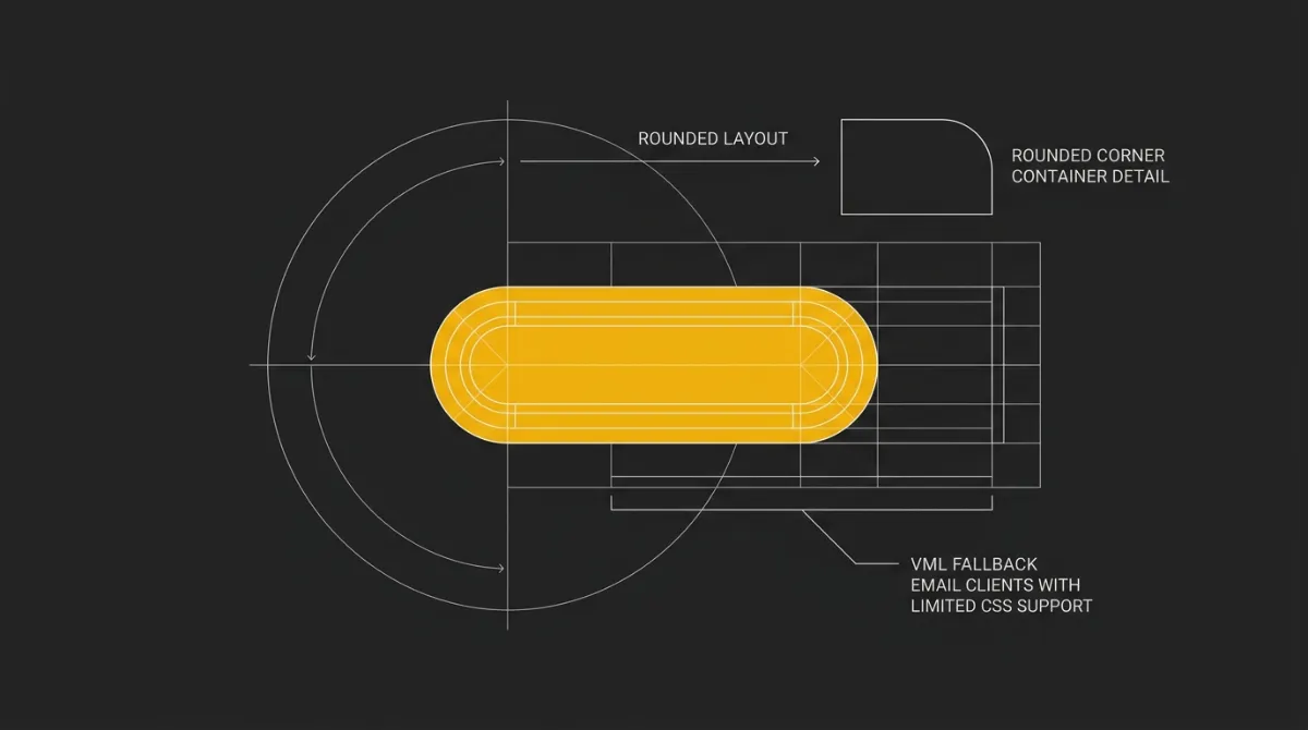
Best for: anyone sending to a list with a meaningful share of Outlook on Windows readers, particularly B2B senders where Outlook usage skews higher.
Key points
- Word’s engine drops modern CSS silently:
border-radius, shadows, and gradients aren’t unsupported with an error, they’re just ignored, so a “rounded” button quietly becomes a rectangle with no warning in your test send. - The bulletproof pattern is two buttons in one: a
<v:roundrect>inside[if mso]conditional comments for Outlook, plus a standard<a>with inlinedisplay:inline-block, padding, background-color, and border-radius for every other client. - Don’t rely on
max-widthalone on Outlook tables: Word’s engine handles table width behavior differently than a browser would, so pairing the HTMLwidthattribute with inline styles matters more here than almost anywhere else in the template. - Set the button’s background on the
<td>too: giving the containing cell abgcolorattribute, not just styling the<a>itself, keeps the fill color intact even where Outlook’s rendering quirks strip part of the inline styling.
Strengths
- Delivers a visually consistent, rounded button across Outlook and every modern client instead of a rectangle in one and a pill in the other.
- Isolates the Outlook-specific markup inside conditional comments, so it never affects rendering in clients that don’t need it.
- Matches the same background color declaration pattern used elsewhere in the template (attribute plus inline style), keeping the approach consistent rather than a one-off hack.
Weaknesses
- VML syntax is verbose and unfamiliar territory for anyone used to writing plain CSS, which adds a learning curve to what should be a simple button.
- Maintaining two parallel versions of every CTA (VML and live
<a>) means twice the markup to update if the button style changes later.
Who it’s for
This rule is essential for anyone whose audience includes corporate or B2B recipients, where Outlook on Windows remains a common default client. If your test sends only check Gmail and Apple Mail, a template that looks polished everywhere else can still land as a flat, square button the moment it hits an Outlook inbox.
7. Design Inline-First, Layer Media Queries Last
Overview
Build the inline, fluid layout first so it looks correct with the entire <style> block removed, then add media queries and dark-mode overrides as the final, optional layer.
This is a sequencing rule as much as a technical one. If you write your media queries first and treat the inline styles as an afterthought, you end up with a layout that depends on the <style> block to look right, which is exactly the failure mode every other rule on this list is trying to prevent. Building in the opposite order, inline layout first, verified on its own, responsive polish last, forces every load-bearing decision to get made where it survives stripping, instead of getting buried inside a media query that might never fire.
Best for: anyone coding a template from scratch, or reviewing one built by someone else, who wants a repeatable process rather than a one-off fix.
Key points
- Start every element with inline styles: font size, color, padding, width, before touching a single media query, so the base layout is complete and correct on its own.
- Verify in a stripped state before adding anything else: delete the
<style>block entirely (or view the email in a client known to drop it) and confirm the layout, typography, and colors still hold up. After the stripped layout holds, run the markup through a free HTML email tester to catch Gmail clipping, Outlook width problems, and missing alt text. - Add media queries and dark-mode overrides last: treat this as the final polish pass, applied only once the inline foundation has already passed its own test.
- Watch total file size as you go: keep the finished HTML comfortably under Gmail’s roughly 102KB clipping threshold, targeting closer to 80KB, since verbose inline markup adds up fast across a long template.
Strengths
- Produces output that’s correct by construction, rather than output that happens to work because the
<style>block loaded that particular time. - Makes debugging simpler: if something looks wrong, the inline layer is the first and most likely place to check, since it’s supposed to carry the whole design on its own.
- Keeps file size in check almost as a side effect, since building inline-first forces you to notice bloat as you go rather than discovering it at the end.
Weaknesses
- Requires real discipline to stick to the order, it’s tempting to reach for a quick
<style>rule instead of writing out the inline attribute properly. - The resulting source is more verbose than a stylesheet-driven approach, which makes hand-editing slower even though the output is more reliable.
Who it’s for
This is the workflow for anyone hand-coding templates regularly, not just fixing a single email once. If you’re relying on an ESP’s default template as your starting point, this is also the sequence worth checking for, since a template built media-query-first is the one most likely to fall apart the moment a client strips its <style> block.
For a look at how this discipline gets applied across an entire template system rather than one email at a time, see how a system produces render-safe email.
8. Do Not Depend on Your ESP’s Auto-Inliner
Overview
An auto-inliner, whether it’s a setting in your ESP or a standalone tool, is a convenience layer, not a guarantee, so the safer habit is to emit already-inlined CSS yourself and treat the inliner as a backstop.
The failure mode here is quiet: you write CSS in a <style> block, assume the platform will flatten it into inline attributes before sending, and never actually verify that it did. Some ESPs don’t even auto-inline by default, MailerLite’s Custom HTML editor, for instance, ships an “Automatic CSS inline” setting that has to be checked, not assumed. If that toggle is off, or the setting doesn’t exist on the platform you’re using, every style you left in the <style> block ships exactly as written, selector and all, straight into inboxes that will strip it.
Best for: anyone sending through an ESP’s custom-HTML editor or a template tool with an inlining feature, rather than hand-verifying every send.
Key points
- Some ESPs leave auto-inline off by default: a setting like MailerLite’s automatic CSS inlining has to be actively enabled, it isn’t a universal default you can assume is running behind the scenes.
- Inliners deliberately leave
@mediaalone: this is correct behavior, since media queries can’t be inlined, but it also means the tool isn’t checking whether your core layout styles were written as selectors that needed flattening in the first place. - External stylesheets need a manual step first: if your CSS lives in a linked file rather than a
<style>tag in the document, most inliners won’t reach it at all, it has to be pasted into the HTML before the inlining pass can process it. - Verify the output, don’t assume it: open the generated HTML and check that font size, color, and layout properties actually appear as
style=""attributes on the elements, not just as rules sitting in a<style>block.
Strengths
- Speeds up authoring by handling the mechanical flattening step so you’re not hand-writing every style attribute.
- Catches styles you might have missed manually, since a decent inliner processes the whole document rather than the handful of elements you remembered to check.
- Frees you to write and maintain CSS in a more readable stylesheet format during development, then flatten it only at the export step.
Weaknesses
- Failures here are silent: if a setting is off or a stylesheet wasn’t reachable, you get unchanged output with no error, and the first sign of trouble is a broken send.
- Relying on the tool can create false confidence, since “I ran it through an inliner” isn’t the same as “I confirmed every load-bearing style is actually inline.”
Who it’s for
This rule matters most for anyone whose workflow depends on an ESP’s built-in tools rather than hand-coding and manually verifying HTML before every send. If you’re checking a template an ESP or a contractor handed you, confirming the inline attributes are actually present, rather than trusting that “it went through the inliner”, is a fast way to catch a template that’s one stripped <style> block away from breaking.
9. Avoid the Selector-Based Core Typography Anti-Pattern
Overview
The single defining mistake in email CSS is putting core typography or layout in <style>-block selectors and hoping the block survives the trip to the inbox.
This is the anti-pattern every other rule in this list exists to prevent, and it’s worth naming directly because it’s an easy trap to fall into: a <style> block with classes for headings, body text, and buttons looks clean, reads well in a code editor, and renders perfectly the moment you preview it in your own browser. None of that tells you what happens when the block gets stripped, because your browser preview never strips it. The only real test is the one this list has referenced throughout: does the email still look correct with that <style> block deleted entirely.
Best for: anyone auditing an existing template, their own or one inherited from an ESP default, to find the single most common reason it breaks in the wild.
Key points
- Why it looks fine in preview but fails in production: your browser and most preview tools render the
<style>block faithfully, so the gap only shows up once the email hits Gmail, mobile clients, or any environment that strips it, by which point it’s already in someone’s inbox looking wrong. - The tell is simple: delete the entire
<style>block and reload the email; if the type turns to default serif, colors vanish, or the layout collapses, that confirms load-bearing styles were left as selectors instead of inline attributes. - The fix is one direction only: move every declaration the layout depends on, font size, weight, color, line-height, spacing, into inline
style=""attributes on the element itself, and reserve<style>for what genuinely can’t be inlined. - Keep the two purposes separate during development: one
<style>block (or a clear mental model) for CSS destined to be flattened inline, and a second, explicitly persist-only block for media queries, dark-mode overrides, and hover/keyframe effects that have to stay as selectors.
Strengths
- Removing this anti-pattern is the single highest-leverage fix available, since it’s the root cause behind most of the specific breakages covered in rules 1 through 8.
- It’s easy to test for: the stripped-
<style>check takes seconds and gives an unambiguous pass or fail, unlike more subtle rendering quirks. - Fixing it once, at the habit level, prevents the mistake from recurring in every future template rather than requiring a fix per email.
Weaknesses
- Breaking the habit of writing clean, selector-based CSS takes real discipline, especially for anyone used to standard web development where this pattern is normal and encouraged.
- Auditing an existing library of templates for this anti-pattern is tedious work, since it means checking every element rather than skimming the
<style>block once.
Who it’s for
This closing rule is for anyone who wants a fast diagnostic for whether a template, theirs or a default from an ESP, was actually built to survive real inboxes. If you only have time to check one thing before your next send, strip the <style> block and see what’s left standing.
How to Apply These Inline CSS Rules to Your Workflow
The 9 rules above turn into a repeatable process with four decisions, made in this order, every time you build or audit a template.
Decide what is load-bearing
Font size, weight, color, line-height, and every layout dimension go inline, no exceptions. Everything else, media queries, dark-mode overrides, hover states, keyframes, is enhancement and belongs in <style> with an inline fallback underneath it.
Test with the style block removed
Delete the entire <style> block and reload the email; if the layout collapses, the type reverts to a default font, or the colors disappear, something load-bearing wasn’t actually inlined. This single test catches the anti-pattern from rule 9 faster than any code review.
Choose an inliner or generate inline output
You’ve got three real options: hand-write every style inline, run your CSS through an inliner tool before sending, or use a system that emits already-inlined HTML from the start. Whichever path you pick, verify the actual output, don’t assume the tool or platform caught everything.
Verify across Gmail, Outlook, and mobile
These are the environments that punish selector-based CSS hardest, Gmail for stripping <style> in specific contexts, Outlook for rendering with Word’s engine instead of a browser, and mobile clients for compounding both problems on a smaller screen. A template that passes all three is doing the job this whole list set out to define.
If building and re-checking every rule by hand isn’t where you want to spend your time, EmailTemple’s studio generates templates with the inline-first, dark-mode-safe backbone already built in, so you describe the email and export something that’s already passed this checklist.
Frequently Asked Questions
Do I have to inline all CSS in email or can I use a style tag?
You have to inline anything load-bearing, font size, weight, color, line-height, and layout dimensions, because a <style> tag alone isn’t a safe place for styles your design can’t survive without. A <style> block still has a place in the template, but only for things that are genuinely enhancement: media queries, dark-mode overrides, hover states, and animations that the email should look fine without.
Why does Gmail strip style blocks?
Gmail strips <style> blocks in specific contexts rather than as a blanket rule, including non-primary Gmail accounts, CSS with syntax errors, and blocks that exceed roughly 8KB in size. It doesn’t happen on every send in every account, but it happens often enough that any style you depend on for the email to look right needs to be inline rather than betting on the block surviving.
Can I keep media queries when I inline CSS in email?
Yes, media queries have to stay in a <style> block since they can’t be written as inline attributes at all, and most inlining tools leave @media rules alone by design rather than trying to flatten them. The layout still needs to look correct without those media queries firing, since they’re responsive polish layered on top of an already-working inline structure, not the thing holding it together.
How do I inline an external stylesheet for email?
An external stylesheet linked via <link rel="stylesheet"> won’t be reached by most inlining tools, so the first step is copying that CSS into a <style> tag inside the HTML document itself. Once it’s sitting in a <style> block in the same file, an inliner (or manual pass) can process it and flatten the load-bearing rules into inline style="" attributes on each element.
Do email inliner tools handle dark mode and hover styles?
No, inliner tools are built to leave these alone rather than flatten them, since hover states, keyframe animations, and pseudo-selectors have no inline equivalent to begin with. Some tools support a flag, often something like a data-embed attribute on the <style> tag, that tells the inliner “persist this block as-is” rather than trying to process it, which is exactly the behavior you want for this category of styles.
Does my ESP inline CSS automatically?
Sometimes, and it’s not something to assume without checking, some ESPs include an automatic CSS inlining setting that may be off by default rather than enabled out of the box. The safer approach is to verify the actual HTML your ESP sends, confirming load-bearing styles show up as inline attributes, rather than trusting that a setting you never checked is doing the work for you.