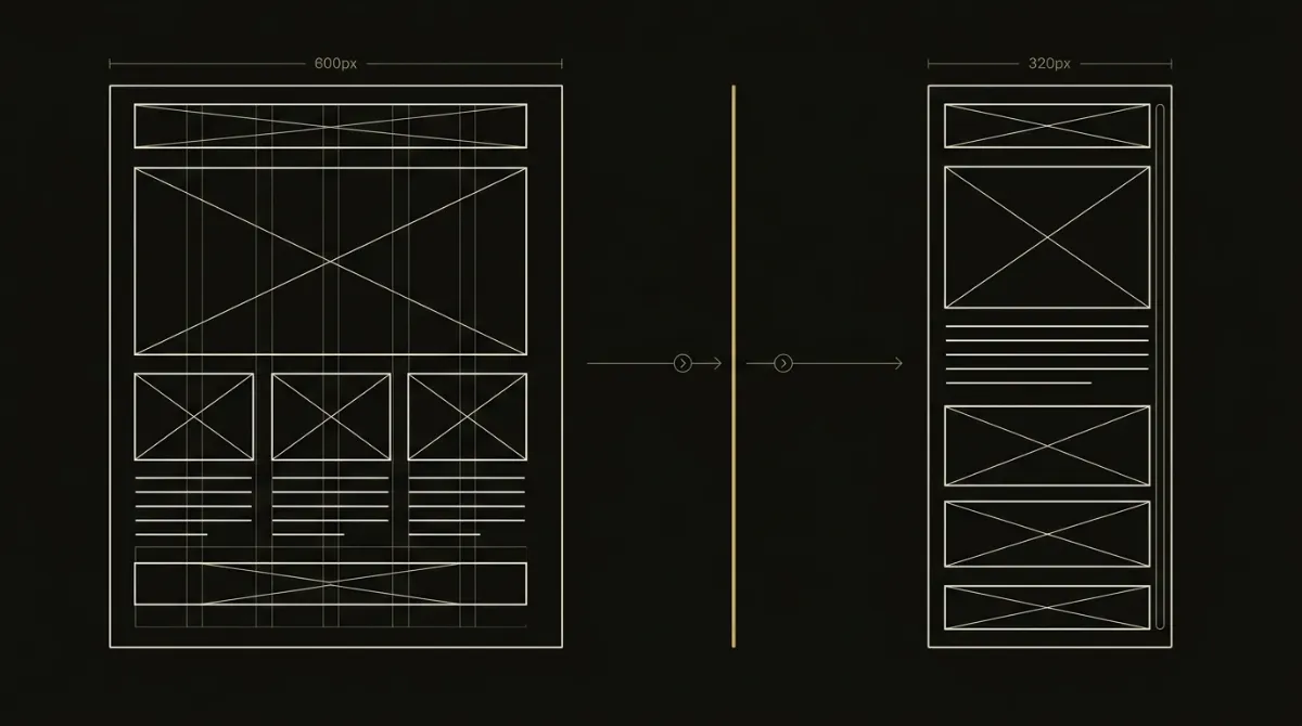
A mobile responsive email template is the difference between a subscriber reading your message and deleting it after one glance at a broken layout. The most common failure is a fixed pixel width baked into the outer table: something like width="600" renders fine on a laptop, but on a 375px phone screen it forces the whole email wider than the viewport, and the reader gets a horizontal scrollbar and a wall of tiny, cropped text instead of your offer.
The fix comes down to one rule when you build an email template: fluid first, media queries second, never the reverse. Get that order backwards, and your layout depends on a <style> block that Gmail and other clients are known to strip in certain conditions, which means the “responsive” version never even loads. Done right, the backbone of the email shrink-fits any viewport from 320px up on its own, with or without CSS, because the mobile responsive email template structure itself, not the styling on top of it, is what keeps the layout intact.
Quick Build: The Responsive Backbone
Skip the theory: here’s the structure that makes an email survive any inbox, phone, or client before a single media query gets involved. Grab the items below, then apply the three rules exactly as written, since this backbone is what EmailTemple treats as non-negotiable on every template it generates.
What you’ll need
| Item | Why it matters |
|---|---|
| A code editor (VS Code, Sublime, or similar) | You’re hand-editing raw HTML tables, not a visual canvas, so plain-text editing with syntax highlighting catches typos before they break a <td>. |
| A fixed 600px design width in mind | Nearly every inbox renders comfortably at 600px; it’s the ceiling your fluid backbone caps out at on desktop. |
| A rendering or preview tool (Litmus, Email on Acid, or a test send to yourself) | Code that looks right in a browser can still break in Outlook or Gmail, so you need to see the actual client rendering before you ship it. |
The 3 backbone rules at a glance
- The body container gets
width="100%"as an HTML attribute plusmax-width:600pxas an inline style, never a fixedwidth="600"orstyle="width:600px". - Every nested table inside that container also uses
width="100%", with no fixed pixel widths anywhere in the chain. - Every image carries
max-width:100%; height:autoso it shrinks with its cell instead of forcing the layout wider.
The one-liner worth memorizing: the max-width caps desktop at 600, the width=100% lets it shrink. Get this backbone right and the mobile responsive email template holds its shape on a 320px phone screen with zero media queries in play, which matters because plenty of inboxes strip the <style> block that your media queries live in anyway.
How to Build the Backbone Step by Step
Below is the fluid backbone laid out as three buildable steps, in the order they need to happen. Each step includes the exact markup, why it matters, and a quick check you can run before moving to the next one.
width=“100%” attribute and a max-width:600px inline style on the same element. This single line is the structural fallback that holds the layout together even if every stylesheet gets stripped.width=600 or style=“width:600px” on the body container.width=“100%”, no exceptions. A single fixed-pixel table buried three levels deep is enough to force the whole email wider than the screen.width=” followed by a number instead of 100%: there should be zero matches inside the body.width attribute, since Outlook uses that attribute for sizing and ignores the CSS max-width on its own.With all three steps in place, the mobile responsive email template backbone is complete and holds its shape without a single line of CSS in a <style> block. The next layer, media queries, only adds refinements like column-stacking on top of this foundation, never the reverse.
Why Fluid-First Beats Media-Query-First
Gmail webmail and several mobile clients strip <style> blocks under specific conditions: a CSS error somewhere in the block, a block over roughly 8KB, or mail retrieved through a non-primary Gmail account inside the Gmail app. Any media query living inside that stripped block simply never fires, and the reader is left with whatever the raw HTML renders without it.

If your only responsiveness is a media query, a stripped style block leaves you with a broken layout. That’s the entire argument for building fluid first: get the layout to shrink-fit on its own using width="100%" and max-width:600px, then layer media queries on top only for the extras, column-stacking, type-size reductions, padding adjustments, never as the mechanism that makes the mobile responsive email template actually responsive. Media queries are the enhancement, not the foundation, and treating them as the foundation is how a perfectly good-looking desktop preview turns into a horizontal-scroll mess on someone’s phone.
Add Media Queries to Stack Columns
With the fluid backbone holding on its own, media queries now layer two enhancements on top: exact breakpoint targeting and clean column-stacking. Neither works well without the other, so build them together.
Set the breakpoint to exactly 600px
The mobile override has to match the body container’s width precisely: @media only screen and (max-width: 600px), never 620px, 640px, or any other round number that feels close enough. The breakpoint is tied to the body width by design, not by convention.
Here’s why the exact number matters: if you set the breakpoint above 600, any viewport between 601px and your breakpoint value still gets mobile styles applied to what is, at that width, a 600px desktop layout. That mismatch shows up as wrong padding and columns stacking when they shouldn’t, on a screen that’s technically wide enough for the desktop version. Match the number to the container width and that failure mode disappears entirely.
The stack and stack-pad pattern
Column stacking on mobile runs through two small utility classes layered onto the fluid backbone:
@media only screen and (max-width: 600px) {
  .stack {
    display: block !important;
    width: 100% !important;
  }
  .stack-pad {
    padding: 0 0 24px 0 !important;
  }
}
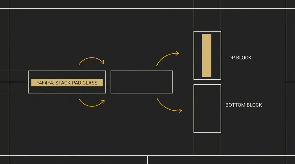
.stack does the actual work: it forces a table cell that normally sits side-by-side with another to drop to full width and stack vertically once the viewport shrinks past 600px. But applying .stack alone to both columns in a row leaves the stacked blocks touching each other with no breathing room, since neither one carries any spacing.
That’s what .stack-pad fixes, and where it goes matters. The leading column, whatever appears first: an avatar, an icon, a hero image, the first block of text, gets class="stack stack-pad". The trailing column, the one that ends up stacked below it, gets only class="stack". The leading column’s .stack-pad adds the gap above the trailing column once they’re stacked; the trailing column doesn’t need its own bottom padding because nothing sits below it in that pair. Get the leading/trailing assignment backwards and you’ll see the visual gap show up in the wrong place, or not at all, in an otherwise correctly stacking mobile responsive email template.
Layout Math: Keep Every Row Under 600px
Outlook’s most common overflow bug isn’t a rendering mystery, it’s arithmetic. The rule: outer padding + inner table width + (inner cell padding × number of columns) + column widths must total 600px or less, and horizontal padding gets applied once per row, never stacked on both the outer wrapper and the inner cell. The classic way this breaks: a wrapper <td> with padding:0 32px wraps an inner table whose own <td> also carries padding:0 32px. That’s 64px of padding on each side, 128px total, added on top of a 600px table for roughly 664px, and Outlook doesn’t gracefully clip the overflow, it just widens the container and breaks the layout.
Two-column rows fail the same way if you don’t walk the math first. A safe two-column row looks like 260px + 260px + 24px gutter = 544px, comfortably inside a padded 600px container. A broken one looks like two 300px columns dropped into a wrapper with 32px of padding on each side: 300 + 300 + 64 = 664px, the same overflow number as the single-column trap above. Before shipping any mobile responsive email template, walk the widest row in the design by hand and add up every padding, gutter, and column width in that row, since Outlook’s rendering quirks around this exact overflow deserve their own deep dive if you want the full Outlook-specific fixes.
Fluid vs Hybrid vs Mobile-Friendly Layouts
Competitors often use “responsive,” “hybrid,” and “mobile-friendly” as if they’re interchangeable, but they describe genuinely different levels of resilience. The table below lines up four approaches against the one question that actually matters: what happens when the email client strips the <style> block and your media queries never get a chance to fire.
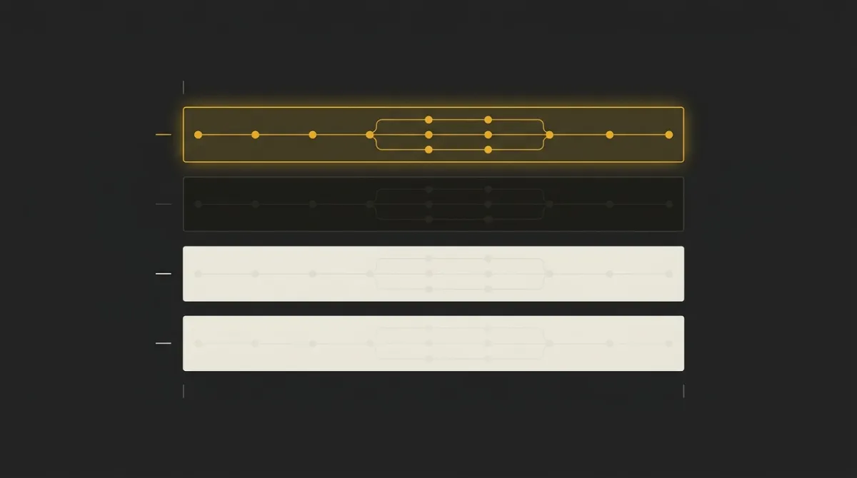
| Approach | How width is controlled | Depends on media queries | Survives stripped style block | Best for |
|---|---|---|---|---|
| Fluid / responsive backbone (width=100% + max-width:600px) | HTML width=100% attribute, capped by inline max-width:600px | No | Yes | Any send where reliability across clients matters more than fine-grained control |
| Hybrid / spongy (fluid % + MSO ghost tables) | Fluid percentages by default, MSO conditional comments restrain width in Outlook | No | Yes | Complex multi-column layouts that need tight Outlook control without leaning on CSS |
| Media-query-only responsive (fixed width, overridden by @media) | Fixed pixel width, overridden only inside a media query | Yes | No | Nothing you’d ship today; the fallback state is a broken desktop-width layout on mobile |
| Mobile-friendly (larger fonts/buttons, no adaptation) | Static sizing chosen with mobile readability in mind, same for every screen | No | N/A (no responsive behavior to lose) | Simple transactional or plain-text-style sends where layout never changes shape |
The distinction that matters most is the third column. Media-query-only responsive design looks identical to a fluid backbone in a code review, but the moment a client strips the <style> block, it collapses to a fixed-width layout with no fallback, while fluid and hybrid approaches keep working because their width control lives in HTML attributes and inline styles rather than inside the vulnerable block. Mobile-friendly isn’t really a competitor to the other three, it’s a simpler, static approach that never had adaptive behavior to lose in the first place, which is also why it can’t scale to more complex layouts the way a properly built mobile responsive email template can. For most sends, the fluid backbone hits the best ratio of resilience to implementation effort; hybrid earns its extra complexity only when a layout genuinely needs Outlook-specific column control that fluid alone can’t deliver.
Make Images and Text Adapt on Mobile
Layout stacking gets most of the attention, but images and type are where a lot of otherwise-solid templates quietly fall apart on small screens. Both need their own fluid treatment layered on top of the backbone.
Fluid images
Every image needs three things working together: an explicit pixel width attribute, descriptive alt text, and the inline style display:block; max-width:100%; height:auto; border:0;. The explicit width isn’t redundant with the CSS, it’s there specifically for Outlook, which sizes images off that attribute and largely ignores max-width on its own. Drop the width attribute and you’re relying on Outlook to guess, which it does badly.
One more detail that trips people up: if a <td> holds nothing but a block-level image, no surrounding text, give that cell line-height:0; font-size:0;. Outlook and Yahoo Mail both add a few pixels of phantom whitespace below block images by default, and zeroing out the cell’s line-height and font-size is what kills it. Skip this and you’ll see a mysterious gap under hero images that has nothing to do with your actual padding values.
Readable type sizes
Body copy shouldn’t drop below 14px, and 16px is the safer default once you’re specifically thinking about mobile screens, since smaller text on a phone forces the reader to zoom, and zooming is a pinch away from deleting the email. Media queries can bump type size or loosen line-height further for small screens on top of that baseline, but the baseline itself has to hold up without any media query firing at all, the same logic that governs the mobile responsive email template backbone everywhere else. Treat 14-16px as the floor a reader gets even in the worst-case rendering environment, not a number you only hit after enhancements kick in.
The Complete Mobile Responsive Email Template Code
Here’s everything from the sections above assembled into one copy-paste starting point: the fluid backbone, the stack/stack-pad column pattern, and fluid images, all working together in a single document.
<!DOCTYPE html>
<html>
<head>
<meta charset="UTF-8">
<meta name="viewport" content="width=device-width, initial-scale=1.0">
<title>Mobile Responsive Email Template</title>
<style type="text/css">
  /* Progressive enhancement only — the layout below already works without this block */
  @media only screen and (max-width: 600px) {
    .stack {
      display: block !important;
      width: 100% !important;
    }
    .stack-pad {
      padding: 0 0 24px 0 !important;
    }
  }
</style>
</head>
<body style="margin:0; padding:0; background-color:#f4f4f4;">

<!-- OUTER WRAPPER: 100%-wide centering table -->
<table role="presentation" width="100%" cellpadding="0" cellspacing="0" border="0">
<tr>
<td align="center" style="padding:24px 16px;">

  <!-- BACKBONE: width=100% + max-width:600px, never a fixed width=600 -->
  <table role="presentation" align="center" width="100%" cellpadding="0" cellspacing="0" border="0" style="max-width:600px;">

    <!-- Hero image row -->
    <tr>
      <td style="line-height:0; font-size:0;">
        <img src="https://example.com/hero.jpg" width="600" alt="Product hero" style="display:block; max-width:100%; height:auto; border:0;">
      </td>
    </tr>

    <!-- Headline row -->
    <tr>
      <td style="padding:32px 24px 16px 24px; font-family:Arial, Helvetica, sans-serif; font-size:24px; line-height:1.3; color:#1a1a1a;">
        A headline that stands on its own
      </td>
    </tr>

    <!-- Two-column row that stacks on mobile -->
    <tr>
      <td style="padding:0 24px 32px 24px;">
        <table role="presentation" width="100%" cellpadding="0" cellspacing="0" border="0">
          <tr>
            <!-- Leading column: gets BOTH stack and stack-pad -->
            <td class="stack stack-pad" width="50%" valign="top" style="padding:0 12px 0 0;">
              <img src="https://example.com/feature-1.jpg" width="260" alt="Feature one" style="display:block; max-width:100%; height:auto; border:0;">
              <p style="font-family:Arial, Helvetica, sans-serif; font-size:16px; line-height:1.5; color:#333333; margin:12px 0 0 0;">
                Short description of the first feature.
              </p>
            </td>
            <!-- Trailing column: gets stack only, no stack-pad -->
            <td class="stack" width="50%" valign="top" style="padding:0 0 0 12px;">
              <img src="https://example.com/feature-2.jpg" width="260" alt="Feature two" style="display:block; max-width:100%; height:auto; border:0;">
              <p style="font-family:Arial, Helvetica, sans-serif; font-size:16px; line-height:1.5; color:#333333; margin:12px 0 0 0;">
                Short description of the second feature.
              </p>
            </td>
          </tr>
        </table>
      </td>
    </tr>

    <!-- Footer row -->
    <tr>
      <td style="padding:24px; font-family:Arial, Helvetica, sans-serif; font-size:13px; line-height:1.5; color:#777777; text-align:center;">
        Your Company Name, 123 Main St, City, Country<br>
        <a href="#" style="color:#777777;">Unsubscribe</a>
      </td>
    </tr>

  </table>
  <!-- END BACKBONE -->

</td>
</tr>
</table>

</body>
</html>
Before this goes anywhere near a send, swap in your own font stack (Arial is the safe placeholder here, not a recommendation), replace both placeholder image URLs with real hosted assets, and update the footer address and unsubscribe link to your actual sender details. One thing to never do regardless of what you customize: never point an <img src> at a base64 data URI, it’s a bug in every context, not a shortcut, since it bloats the document and can push you past Gmail’s clipping threshold. Run this exact structure through a preview tool at 320px before you trust it, and you’ve got a working mobile responsive email template that holds up whether or not the client ever loads a single line of your <style> block.
Test Your Template Before You Send
Code that looks correct rarely tells you the whole story until it’s actually rendering somewhere. Run through this before any real send goes out:
- Resize the preview to 320px and confirm there’s no horizontal scrollbar.
- Confirm the two-column row actually stacks into a single column on mobile widths.
- Strip or disable the
<style>block and check the layout still holds, this is the Gmail-stripped-style scenario, not a hypothetical. - Preview in Outlook specifically and walk the widest row’s math by hand to rule out the 664px overflow trap.
- Confirm every image shrinks proportionally instead of overflowing or getting cropped.
- Send a real test to yourself, not just a browser preview, since some rendering quirks only show up in an actual inbox.

Hand-coding this backbone correctly, every table at width="100%", every image carrying the right style trio, the stack and stack-pad classes on the right columns, is easy to get right once and just as easy to get subtly wrong on the next template, especially under deadline. That’s the exact structural work a tool can hold constant on every generation, so responsiveness never comes down to whether a media query happened to survive the trip to someone’s inbox. If you’d rather skip re-deriving this backbone by hand each time, you can generate your branded template for free and start from a structure that’s already built this way.
Frequently Asked Questions
Why does my email have a horizontal scroll on mobile?
Horizontal scroll almost always comes from a fixed pixel width somewhere in the layout, most often width="600" or style="width:600px" on the body container or a nested table. Fix it by switching to width="100%" with max-width:600px as an inline style, which lets the layout shrink to fit any screen instead of forcing a fixed 600px that overflows a 375px phone.
Do I need media queries for a responsive email?
No, not for the base layout. A fluid backbone built with width="100%" and max-width:600px handles the shrinking on its own, and media queries only layer on extras like stacking two-column rows into one column or adjusting type size for small screens.
What width should a responsive email template be?
600px is the standard maximum width for a desktop-viewed email, set via max-width:600px rather than a fixed width. Below that ceiling, the layout should stay fluid and shrink all the way down to 320px, the narrowest common phone viewport, without ever triggering a horizontal scrollbar.
Why is my two-column layout not stacking on mobile?
The most common cause is a missing or misapplied .stack class, or a breakpoint that isn’t set to exactly max-width: 600px. Check that both columns carry class="stack", that the leading column also carries stack-pad for spacing, and that the media query’s breakpoint number matches the body container’s width exactly.
Does responsive email design work in Gmail and Outlook?
Yes, as long as the backbone is fluid rather than dependent on media queries alone, since Gmail strips <style> blocks in certain conditions and a media-query-only layout breaks the moment that happens. For Outlook, the fluid backbone needs to be paired with row-width math that keeps every row at or under 600px, since Outlook’s rendering engine doesn’t forgive the same overflow that other clients quietly absorb.