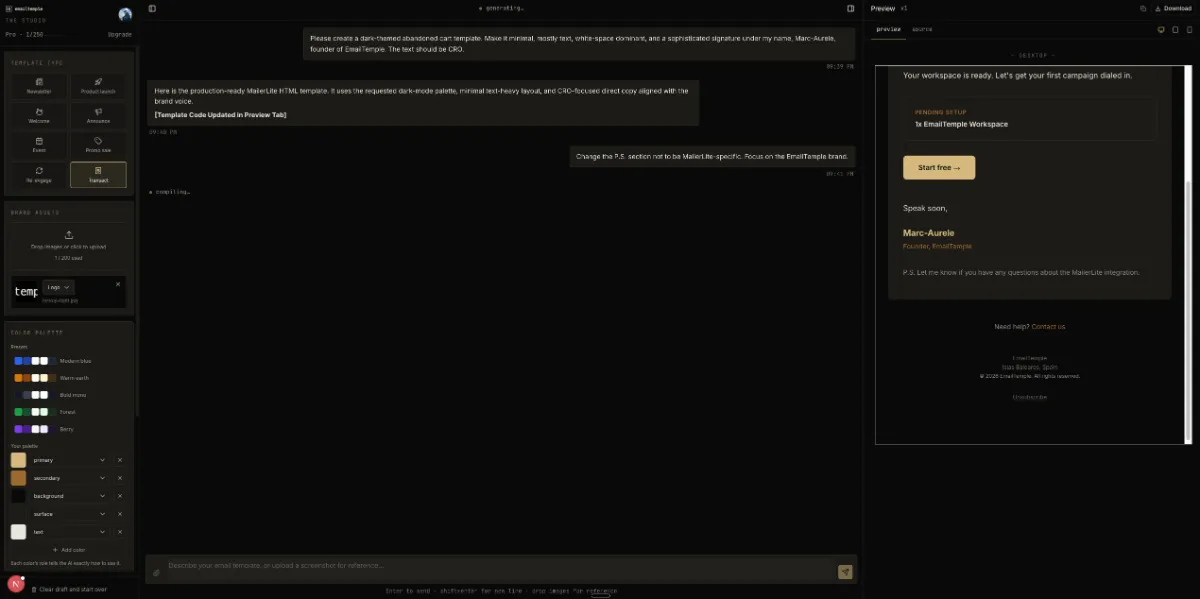
If you’ve searched how to build an email template because your ESP’s default options make your brand look like an afterthought, you’re diagnosing the right problem. The real challenge isn’t picking a nicer layout from a gallery: it’s producing something that renders correctly across Gmail, Outlook, and Apple Mail, holds up in dark mode, and still looks considered rather than templated once it lands in an inbox.
This guide covers two routes to get there: coding the template yourself by hand, or describing what you want and generating it. Either way, you’ll end up needing the same core pieces: a responsive 600px backbone that shrink-fits any screen, dark-mode-safe colors and backgrounds, a clear CTA that earns the click, and a clean export into whatever ESP you’re sending from. For a shortcut through most of this, you can generate your branded template for free instead of building it line by line.
Quick Steps to Build an Email Template
Building an email template that renders well and looks intentional takes seven steps, from setting a fixed-width backbone to exporting into your ESP’s exact syntax. Below is what to gather first, then the sequence at a glance, before the full walkthrough in the next section.
What You’ll Need
You need five things on hand before you start: a way to write or generate the HTML, your brand’s colors and fonts, a logo file, a target ESP, and a test inbox to check rendering.
| Item | Why it matters |
|---|---|
| A code editor or a template generator | You need somewhere to write the table-based HTML (or somewhere that writes it for you) since email markup isn’t built in a page builder |
| Brand colors and fonts | The palette and type scale drive every zone in the email; without them you’re just filling in a generic shell |
| A logo asset | The masthead needs a real logo file (ideally transparent PNG) sized correctly so it doesn’t dominate or vanish in dark mode |
| Target ESP | Mailchimp, ActiveCampaign, MailerLite, and similar platforms each expect their own merge-tag and editable-region syntax, so you need to know the destination before you code |
| A test inbox | You’ll want a real Gmail, Outlook, and Apple Mail account (or a rendering-preview tool) to catch the client-specific quirks that a browser preview won’t show |
The 7-Step Overview
Here’s the full sequence, one sentence per step, before the detailed build-out later in this guide.
- Set the 600px table backbone: build a centering wrapper table at
width="100%"with an inner body table capped atmax-width:600px, so the email shrink-fits any screen from 320px up without a fixed pixel width. - Build the head and preheader: order the
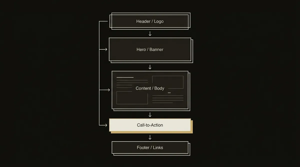
<head>with charset first, then viewport and title, and add a hidden preview-text snippet that complements (not repeats) your subject line. - Lay out zones and modules: break the email into 3 to 5 distinct background zones (hero, body, utility, footer) rather than one flat scroll of content.
- Style type and CTAs inline: set every load-bearing font size, color, and button style as inline
style=""attributes, since many clients strip<style>blocks entirely. - Handle dark mode: declare every zone background twice (an HTML
bgcolorplus an inlinebackground-color) and avoid pure white or pure black so recoloring clients don’t wreck your hierarchy. - Add the footer and unsubscribe link: include a visible, working unsubscribe link and a physical mailing address, since both are legally required and commonly overlooked until the last minute.
- Export to your ESP: convert your placeholders into the correct merge-tag syntax for your destination platform and paste or upload the finished HTML.
That sequence is also, functionally, what happens automatically when you generate your branded template for free instead of hand-coding each step.
Building an email template step by step means working through six sequential stages: the responsive backbone, the head and preheader, zone layout, inline typography and buttons, the compliance footer, and a final render check. Each stage below covers exactly what to build and what tends to go wrong when it’s skipped, drawn from the same construction rules a production email template generator applies on every send.
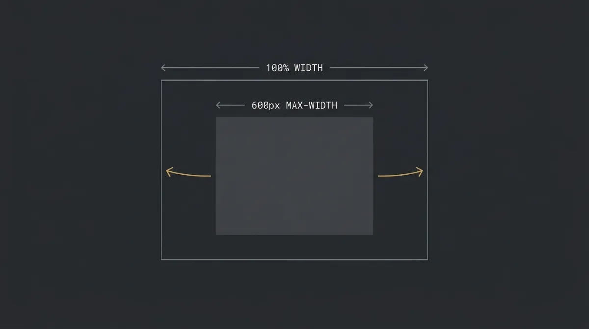
Build the outer wrapper as a centering table at 100% width, then cap the body table at 600px so the whole email shrink-fits any screen. This structural pattern works even when a client strips out <style> blocks entirely, since it relies on plain HTML attributes rather than media queries.
- Set
width="100%"as an attribute on the outer wrapper table - Cap the inner body table with
max-width:600pxas an inline style, never a fixedwidth="600" - Keep every nested table inside at
width="100%", never a fixed pixel value
width="600" anywhere in the chain. It forces the layout to 600px and overflows on narrow phone screens instead of shrinking.Order the <head> so the charset declaration comes first, then add a hidden preheader block that gives the inbox something worth reading next to your subject line. Get this wrong and Outlook on Windows can misrender content, or your preview text leaks into whatever text happens to sit first in the body.
- Place
<meta charset="UTF-8">as the very first child of<head>, before viewport and title - Add a hidden preview-text div plus a fixed 13-pair spacer block immediately after
<body>to stop other content leaking into the preview line - Write preheader copy that complements the subject line, front-loaded in the first ~40 characters, running 40 to 90 characters total
Structure the whole email as nested HTML tables split into 3 to 5 distinct background zones, since flexbox, CSS grid, and CSS columns simply don’t render consistently across email clients. Each zone should read as a deliberate section change, not a continuous scroll of undifferentiated content.
- Build every layout element as a
<table>withrole="presentation", never flex or grid - Give each zone (hero, body, utility, footer) a visibly different background treatment so the shift itself acts as the section divider
- Keep exactly one primary CTA per zone as a button; anything secondary becomes a plain arrow-link instead
Set every load-bearing font size, weight, color, and button style as an inline style="" attribute, since many inboxes strip out <style> blocks in specific contexts. Reserve actual <style> blocks for media queries and dark-mode overrides only, each with an inline fallback already in place.
- Apply a two-tier type scale: one display voice for headlines and stat numbers, one body voice for everything else
- Inline every core typography and color rule rather than relying on a stylesheet selector
- Build standalone CTAs as a bulletproof button: a VML
<v:roundrect>shape for Outlook plus a live<a>tag for every other client
border-radius and no VML fallback. It renders as a square block in Outlook on Windows.Close the template with a footer that carries a visible, functioning unsubscribe link and a physical mailing address, both of which are legal requirements rather than optional polish. Before finalizing, it’s worth opening each personalization field you’ve used and confirming it has a safe fallback if the data is missing.
- Add an unsubscribe link that is never hidden, never set to zero opacity
- Include the sender’s physical mailing address in the same footer block
- Wrap any merge tag or personalization field in your ESP’s conditional syntax so it degrades gracefully when the value is blank
Verify the template against a short checklist before you export: contrast, inlining, and dark-mode duplication all get confirmed here, not discovered after a send. This is the same seven-point pass a production template pipeline runs before it hands back a finished file.
- Confirm body text passes WCAG AA 4.5:1 contrast against its background
- Check that every zone background is declared twice: an HTML
bgcolorattribute plus a matching inlinebackground-colorstyle - Scan for two identical consecutive modules, unstyled links, and any critical style that isn’t inlined
Step 1: Set the 600px Responsive Backbone
The backbone is the fluid outer structure that lets one HTML file render correctly from a 320px phone screen up to a full desktop client, using width="100%" on the wrapper and max-width:600px on the body table rather than a fixed pixel width. This pairing matters because it works as a pure HTML fallback: even in clients that strip <style> blocks and therefore ignore your media queries, the layout still shrinks correctly since nothing in it depends on CSS breakpoints firing.
Step 2: Build the Head and Preheader
The head and preheader are the two pieces of an email that do their job before anyone opens it, so both need to be built with a fixed structure rather than an afterthought. Charset ordering affects whether Outlook on Windows parses the document correctly at all, while the preheader is genuinely the highest-value line of copy after the subject itself, since it’s the second thing a recipient reads in their inbox list.
Step 3: Lay Out Zones and Content Modules
Zone layout is the practice of dividing an email into 3 to 5 visually distinct background sections instead of one undifferentiated column of content, built entirely with nested HTML tables. Table-based layout isn’t a stylistic preference; CSS flexbox and grid simply fail to render predictably once you leave the browser and land in an actual mail client.
Step 4: Style Typography and Buttons Inline
Inline styling means writing font size, color, weight, and button rules directly into each element’s style="" attribute instead of a shared stylesheet, because a <style> block can get dropped by the receiving client before a reader ever sees it.
Buttons carry an extra requirement on top of that: a bulletproof CTA renders twice, once as a VML shape for Outlook’s Word-based engine and once as a normal HTML link for everything else, so the rounded corners and fill survive both.
Step 5: Add the Footer and Unsubscribe Link
The footer is where compliance lives: a visible unsubscribe link and a physical mailing address are both required by law, and neither should ever be hidden or styled into invisibility. It’s also worth treating personalization fields with the same care here as anywhere else in the template: open each merge tag you’ve used and check that it has a defined fallback, since a first name or account field that isn’t always populated will otherwise render as a gap or a broken token for some portion of your list.
Step 6: Run the Final Self-Check
The final self-check is a short verification pass that catches rendering problems before a send rather than after one, covering contrast, inlining, and dark-mode duplication in a few minutes. Confirming that every zone background is declared twice (an HTML attribute plus a matching inline style) is the single check most likely to catch a dark-mode bug, since recoloring clients don’t all respect the same declaration.
For the shortcut version of all six steps, generate your branded template for free and skip straight to a finished, checked file.
Make the Template Dark-Mode Safe
Making a template dark-mode safe means designing for three unpredictable rendering outcomes at once, not one assumed behavior. Litmus has reported that roughly a third of email opens happen in dark mode, and email clients handle that switch three different ways: some leave your colors alone entirely, some partially invert them, and some fully invert light backgrounds to dark. A template built for email template design that only accounts for one of these behaviors will break for a meaningful share of the list, which makes dark mode a mainstream rendering concern rather than an edge case worth skipping.
Set Every Zone Background Twice
The fix is to declare every zone’s background color twice, once as an HTML bgcolor attribute and once as a matching inline background-color style on the same cell. Recoloring clients tend to respect one declaration or ignore the other, so duplicating it keeps your zone seams and section dividers visible no matter which behavior a given inbox applies. The same logic extends to color choices: avoid pure #FFFFFF and pure #000000 on large surfaces and body copy, since both invert to harsh extremes under forced dark mode; dark-mode body text reads better in the #E0E0E0 to #F2F2F2 range, checked against wcag contrast guidelines so it stays legible rather than washed out.
Colors and Logos That Survive Inversion
A logo needs its own defense against inversion, and the reliable fix is giving it an explicit background cell rather than hoping the surrounding layout protects it. A dark-on-transparent logo can vanish entirely against a forced-dark background, so setting an explicit bgcolor on the logo’s containing cell (matching the masthead) gives the mark a stable backdrop in any of the three rendering modes. What you should never do is bake brand color or copy into the logo image itself as a workaround: that image becomes unreadable if the client blocks images by default, and it defeats the accessibility and translation benefits of keeping every element as live HTML. If you’d rather skip building all of this by hand, you can generate your branded template for free and get a dark-mode-safe version out of the conversation directly.
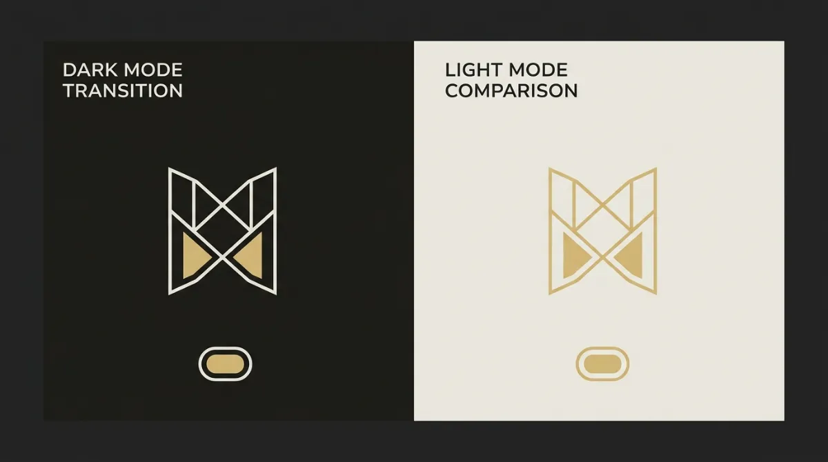
To check a finished file against all three behaviors before it goes out, run it through the free dark mode email tester.
Design for Clicks, Not Just Looks
Designing for clicks starts with deciding the single action the email exists to drive, before you touch layout at all. Every primary button in the email should point at that one goal, whether it’s buy, book, read, or confirm. If a brief genuinely has two competing goals, the stronger one gets the hero and its own button; the other gets demoted to a mid-email module with a plain arrow-link, never a second button competing for the same click.
One Conversion Goal Per Email
The rule here is simple: one primary CTA per zone, rendered as a real button, with everything secondary reduced to an arrow-link. Three or more stacked primary buttons is what’s known as button soup, and it’s an automatic fail in good email template design, since a reader facing five equally-weighted buttons has no way to know which one actually matters. Casper’s welcome email is a clean real-world proof of this: one greeting, one CTA, no competing offers stacked into the first touch. Intercom runs the same discipline in a single activation email rather than a sequence, positioning the product, adding named social proof, and landing on exactly one “Start your free trial” button with no second ask crowding it out. On any email with four or more content modules, repeat that same primary button near the close, using the same destination and label, so a reader who scrolls all the way down doesn’t have to scroll back up to act.
CTA Hierarchy and Placement
Placement matters as much as restraint: keep the first primary button above the fold, in or immediately after the hero, and back it with a bulletproof cta button pattern so it actually renders as a button in every client rather than degrading into a plain link. Right next to that button, a single line of friction-reducer microcopy does real work: something concrete like “No card required” or “Takes 2 minutes” removes the objection sitting between a reader and a click, and it belongs beside the CTA, not buried in the footer where nobody reads it. Urgency follows the same logic of specificity over vagueness: “Ends Sunday” gives a reader something to act on today, while “Limited time” gives them nothing to actually register, and any deadline needs to sit in the hero or beside the button rather than hidden in fine print. Getting this hierarchy right by hand across every zone is exactly the kind of detail a production template generator handles automatically, which is worth knowing if you’d rather skip the manual pass entirely.
Choosing between coding by hand, a drag-and-drop builder, a generic AI copy tool, and a purpose-built AI template generator mostly comes down to one question: how close is the output to something you can actually paste into your ESP and send. The table below compares all four routes on build method, time per email, best fit, and where each one tends to fall apart.
| Approach | How You Build | Time Per Email | Best For | Biggest Weakness |
|---|---|---|---|---|
| Code by hand | Write the table-based HTML and inline CSS yourself, line by line | Several hours per template | Developers who need full, granular control over every tag | Outlook debugging (VML buttons, layout math) eats most of the time |
| Drag-and-drop builder | Assemble blocks on a visual canvas (Stripo, Beefree, or your ESP’s native editor) | 30-60+ minutes per template | Marketers who want visual control without touching code | You rebuild the layout block by block on every new campaign |
| AI copy tool (ChatGPT/Claude) | Prompt a general-purpose model for email copy or raw HTML | Fast copy, but HTML needs manual Outlook fixes after | Drafting subject lines and body copy, not finished markup | A 2026 study found 8 of 9 AI-generated emails had at least one Outlook rendering failure |
| AI template generator (EmailTemple) | Describe the email you want in a conversation | Roughly two minutes per template | Operators who want a finished, dark-mode-safe file ready to export | Refinement still happens through chat rather than direct block-dragging |
An html email template built by hand rewards patience, since nothing beats writing every tag yourself when a client needs a genuinely unusual layout. A drag-and-drop builder trades that control for speed, but it’s still a canvas: you’re reassembling the same blocks every time you send, which is exactly the workflow an ai email template generator exists to skip. Generic copy tools sit in a different category entirely, because writing good copy and producing valid, cross-client email template design markup are not the same skill, and the Outlook failure rate above is the clearest evidence of that gap. It’s also worth noting that AI-generated markup which depends on a specific platform’s proprietary variable or template model can misfire badly if you paste it into a mismatched tool, so whichever route you pick, match the output format to where you’re actually going to send it.
Export the Template to Your ESP
Exporting a finished template means choosing between one portable HTML file with generic placeholders, or a version personalized with your specific ESP’s exact merge tag syntax. Portable, ESP-agnostic HTML uses [UPPER_SNAKE_CASE] bracket tokens like [FIRST_NAME] and [UNSUBSCRIBE_URL], which you find-and-replace with your platform’s native syntax before sending; native mode skips that step and emits the correct tags directly, so Mailchimp gets *|FNAME|*, ActiveCampaign gets %FIRSTNAME%, and MailerLite gets {$name}. Mixing these up is a real bug, not a cosmetic one: pasting Mailchimp’s *|FNAME|* syntax into an ActiveCampaign template, for instance, means the platform won’t recognize the tag at all, and it will render as literal broken text in the sent email rather than a first name.
Getting the file into the right builder matters as much as the syntax inside it, since each ESP has its own custom-HTML entry point rather than a universal upload button. A template that looks correct in preview can still fail on send if the platform expects its own variable or conditional format and finds something else instead, which is exactly what happens when a generic conditional construct gets pasted into an ESP that requires its own syntax for optional content.
- Mailchimp: import through the Classic editor’s “Code your own” (or “paste in code”) path, available on paid plans only.
- ActiveCampaign: paste the HTML directly into the Custom HTML builder under Campaign Templates.
- MailerLite: use the Custom HTML editor, which requires the Advanced plan.
- Any other ESP that accepts a custom HTML import (Klaviyo, HubSpot, Brevo, and similar platforms) can take the portable Universal version, with the bracket tokens mapped to that platform’s tags before you send.
If you’d rather skip mapping merge tags by hand entirely, you can generate your branded template for free with the correct syntax already built in for your target ESP.
Common Mistakes That Make a Template Look Cheap
Most cheap-looking html email template mistakes trace back to a handful of specific, fixable errors rather than vague taste problems. Here’s what to check before you call an email template design finished:
- Rows that overflow 600px in Outlook: adding up outer padding, inner table width, and cell padding across a row can quietly exceed 600px, which breaks the layout specifically in Outlook. Walk the widest row in your template and confirm the total stays at or under 600px, with padding applied once per row, not on both the wrapper and the inner cell.
- Base64 images bloating the file: embedding image data directly in the HTML (a base64 data URI) pushes the whole document past Gmail’s roughly 102KB clipping threshold, which hides everything below the cut, including your unsubscribe link. Host images externally and reference them by URL instead.
- Brand color flooding the whole email: painting every zone in your brand color reads as amateur rather than confident; brand color should cover roughly 10 to 15% of the surface area, with neutrals doing most of the work. Restraint, not saturation, is what signals a considered send.
- Mismatched images inside one grid: a product or feature grid where cards use different sizes, crops, or aspect ratios is one of the fastest ways to look unfinished. Every image in a single grid needs the same dimensions and treatment so the set reads as one deliberate choice.
- An oversized masthead logo: a logo that dominates the header is a common tell of a rushed build. Cap it around 40px tall and no wider than 140px, sized with max-width and max-height rather than fixed dimensions, so it shrinks correctly regardless of the file’s original aspect ratio.
- Copy baked into images: text rendered as a picture instead of live HTML breaks editability, fails screen readers, and often looks wrong once a client applies dark mode. Keep every headline and paragraph as real text, not a flattened graphic.
One less obvious failure worth checking for: a personalization field that’s occasionally empty (a missing first name, a blank enrichment value) can render as a raw, broken token instead of finished copy if it isn’t wrapped in your platform’s conditional syntax, so an email that looks fine in preview can still ship looking broken to part of your list. A free merge tag tester renders the email against a blank field so you can see which lines collapse before you send.
Email Template Examples Worth Copying
Real, documented email template examples show the structural pattern that makes a send work, not just its surface design. The two structures below are worth modeling regardless of what you’re building next.
Welcome Email Structure
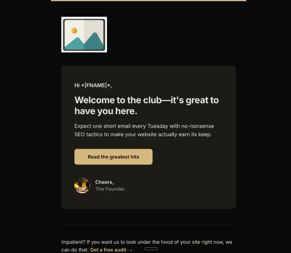
A welcome email works when it does one job per screen: greet the subscriber, state what the brand does, back it up, and point at exactly one action. Really Good Emails breaks down Casper’s welcome email as a clean single-column layout with one clear greeting, plain copy about what the company does, a row of press logos for social proof, and a single CTA with no competing offers stacked into the first touch. hims takes a different but related approach for a digital product: its welcome email uses a minimalist layout built around a product-on-device hero, so the reader sees the app before being asked to install it, with the one CTA being the download itself rather than a wall of benefit copy. Both examples land on the same underlying welcome email lesson: orient the reader first, sell nothing, and never let a first touch carry more than one ask.
That structure is what every template in our free email template archive is built on, whichever ESP it targets.
Newsletter and Promo Structure
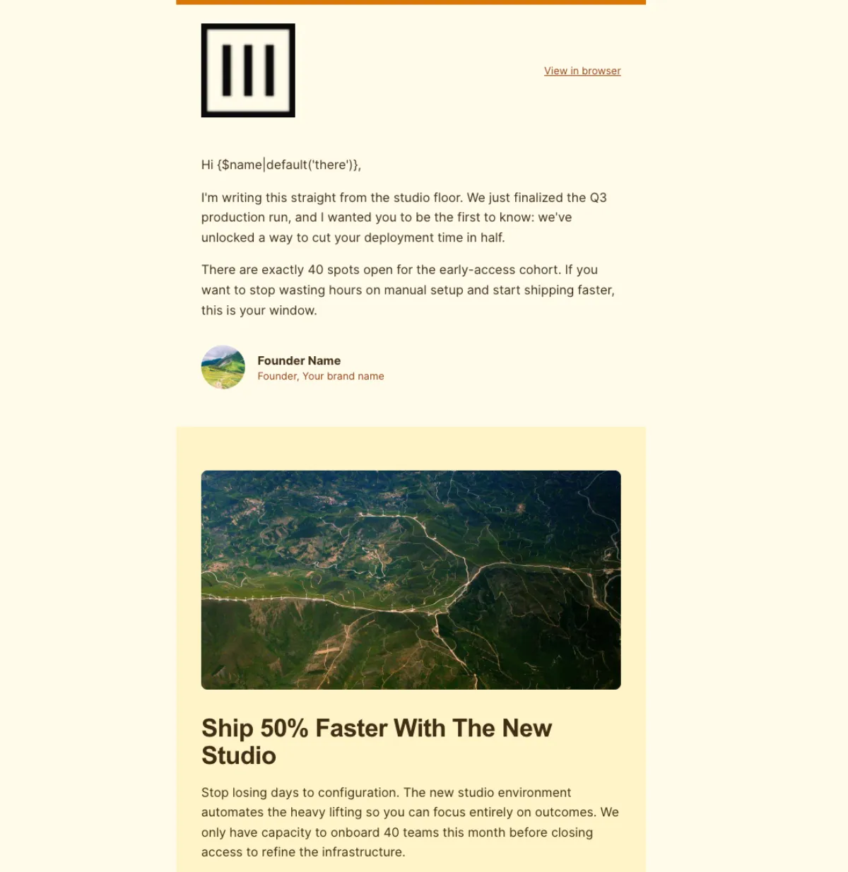
A newsletter earns its scroll by breaking content into short, self-contained blocks and using bold text sparingly, as a wayfinding signal rather than decoration. Morning Brew is documented as using bolding and bullets intentionally to mark topic changes and section transitions, not to emphasize nearly every other word, which is the difference between formatting that guides the eye and formatting that goes numb from overuse; a single column of skimmable blocks under a clean masthead is the reusable shape for any newsletter in this kind of email template design. Promo emails have their own trap worth naming: a teardown of martech marketing emails found that a giant decorative header image at the top is usually a mistake, since it pushes the offer and CTA below the fold, especially on mobile, without giving the reader anything worth the delay. The fix is structural, not stylistic: lead with the offer and headline first, and reserve imagery for visuals that actually carry the message rather than filler that costs attention for nothing.
For the full breakdown of the design rules behind these patterns, see our complete approach to building templates.
Turn Your Template Into a Full Sequence
Which route fits you comes down to how you want to spend your time. Code it by hand if you actually enjoy debugging Outlook’s rendering quirks and want full control over every tag. Use a drag-and-drop builder if you’d rather work visually and don’t mind reassembling blocks for each new send. Describe what you want and let an ai email template generator produce it if what you actually want is a finished, dark-mode-safe file in about two minutes, without touching code or a canvas.
One well-built template is rarely the end of the job, either: most operators need a welcome series, an abandoned-cart flow, or a re-engagement send that all sound like the same brand, not ten disconnected one-offs in different email template design styles. A generator built for this can produce that whole set in one coherent pass, so a welcome email and its follow-ups read as one voice instead of getting stitched together separately. If that’s closer to where you’re headed, generate your branded template for free and see what a finished, on-brand version looks like before you build the rest of the flow around it.
Frequently Asked Questions
What is the standard width for an email template?
The standard width is 600px, built with width="100%" on the outer wrapper table and max-width:600px as an inline style on the body container. This combination lets the email shrink to fit any screen from 320px upward, rather than a fixed pixel width that would overflow on narrow phones. Nested tables inside the body should also use width="100%" rather than fixed pixel widths, so the whole structure scales together.
Do I need to know HTML to build an email template?
No, not if you’re using a generator that produces the file from a description rather than requiring you to write markup yourself. Coding a template by hand does require HTML and CSS knowledge, and a drag-and-drop builder needs neither code nor a written description but does require you to assemble blocks visually. An AI template generator sits between those two: you describe the email in plain language, and the finished HTML comes back without you touching a single tag.
How do I make an email template responsive?
Responsive email design means building a fluid layout that adapts to any screen width, primarily through the 600px backbone rather than relying on media queries alone. This matters because some email clients strip <style> blocks entirely in certain contexts, which means any media queries inside them simply won’t fire; the width="100%" plus max-width:600px pattern works as a pure HTML fallback that holds up regardless. Media queries still add value on top of that foundation, layering in column-stacking and smaller type for narrow screens, but they’re an enhancement, not the structure holding the layout together.
Why do my email templates break in Outlook?
Outlook on Windows renders email using Microsoft Word’s layout engine rather than a browser engine, which is the root cause of most Outlook-specific bugs. Word’s engine doesn’t support CSS features like border-radius or reliable background-image, so a button styled only with modern CSS often renders as a plain square block. The fix is to build layouts entirely with HTML tables and use a VML shape alongside a standard link for any button, since VML is the one thing Outlook’s engine can reliably render as a rounded, filled shape.
How do I keep a template under Gmail’s clipping limit?
Gmail clips any email whose HTML exceeds roughly 102KB, hiding everything past that point behind a “view entire message” link, including your unsubscribe link and closing CTA. The safest practice is to keep total HTML comfortably under about 80KB, which means never embedding images as base64 data directly in the markup, since that alone can push a small template past the limit. Hosting images externally and referencing them by URL instead keeps the file lightweight and keeps your compliance footer safely above the clip point.
Can I use one template across different ESPs?
Yes, if the template is built with portable, ESP-agnostic personalization instead of one platform’s native merge tags. A Universal-style HTML file uses bracket placeholders like [FIRST_NAME] and [UNSUBSCRIBE_URL] that you map to your specific platform’s syntax before sending, and it imports into any ESP that accepts a custom HTML upload. The alternative, building natively for one ESP’s exact tag syntax, only works in that one platform; mixing the two, like pasting Mailchimp tags into an ActiveCampaign template, will render as broken text instead of a working merge field.