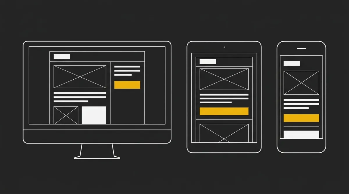
A responsive email adapts its layout to whatever screen it lands on, whether that’s a phone, a tablet, or a full desktop inbox, resizing images and stacking columns so the content stays readable without pinching or scrolling sideways. This matters more than most senders assume: roughly half or more of email opens happen on mobile, depending on which dataset you check, which makes a fixed-width layout a coin flip on whether your subscriber can even read what you sent.
This guide walks through the mobile-first table approach that keeps layouts from breaking, where media queries fit in (and where they don’t), how to keep the design dark-mode safe, the mistakes that quietly tank open and click rates, and a few examples of what good responsive email actually looks like across different screen sizes. If you’d rather skip the manual coding and see what production-ready HTML email generation looks like, that’s the shortcut version of everything below.
What Makes an Email Responsive
A responsive email adapts its layout, text, and images to whatever viewport it lands in, so the reader never has to pinch-zoom or scroll sideways to make sense of it. In practice this means images shrink to fit the screen size, columns collapse from two or three across down to one, and type bumps up in size on smaller devices without anyone touching a setting. Get the layout right and the email reads cleanly whether it opens on a phone, a tablet, or a widescreen monitor.
Responsive vs mobile-friendly vs fluid
Responsive email design specifically means using CSS media queries to shift the layout based on screen width, so the structure itself changes device to device. Mobile-friendly is a lower bar: the email is built with simple, single-column content and larger fonts and buttons, but it doesn’t dynamically restructure anything for different screens. Fluid (sometimes called scalable) email uses percentage-based widths instead of media queries, letting elements stretch and compress to fill whatever space they’re given while the overall layout stays the same.
These get used interchangeably online, but they’re not identical: an email can be coded for mobile without being responsive, and a fluid email is a specific technique for achieving responsiveness with less reliance on breakpoints.
The core rule to remember
Before any media query gets a chance to run, the layout needs a fluid backbone: an outer container set to 100% width with a max-width cap, so it stretches to fill a phone screen and stops expanding once it hits a sensible desktop width. This structure is what keeps the email from breaking when a mail client strips out the <style> block entirely and no media queries fire at all, which happens more often than most senders realize.
Think of media queries as the enhancement layer on top of that fluid foundation, not the thing holding the whole layout up. If you want to see this backbone applied without hand-coding it yourself, that’s effectively what a production-ready HTML email generator is doing under the hood on every send.
Why Responsive Design Affects Opens and Clicks
A non-responsive email forces the reader to pinch-zoom just to read a paragraph, then hunt for a tap target sized for a mouse pointer instead of a thumb. That friction shows up as a bounce, not a complaint, because most users just leave rather than fight the layout. Open rate is the design’s first conversion job: it has to work across different devices before anything else about the email matters.
Once the email actually renders correctly, readability and a touch-friendly layout are what carry a reader from open to click, which is the design’s second job. Click-through rate averages around 2 to 3 percent across industries, and unlike opens, clicks are a fairly honest signal: Apple Mail Privacy Protection has inflated open-rate data industry-wide since 2021 by pre-loading tracking pixels regardless of whether anyone actually looked, so a click is closer to real user intent than an open ever is now. None of this guarantees a lift in revenue. What responsive design does is remove the friction that stops a reader who already opened your email from finishing the read and finding the button, so the content and the offer get a fair shot at working across whatever screen it landed on.
How to Build a Responsive Email Template
Building a responsive email template comes down to three decisions made in order: the fluid backbone that holds regardless of what renders, the mobile-first styles that ship as the default, and the desktop enhancement layered on top with a media query. Below is a two-column newsletter used as the running example, since that’s the layout where responsive email design most visibly breaks or holds.
Before touching code, a short prerequisites check keeps the build from stalling halfway through.
| Tools needed | Purpose |
|---|---|
| A code editor (VS Code or similar) | Write and version the HTML and inline CSS by hand |
| An email testing or preview tool (e.g. Litmus, Email on Acid, or send-to-self across a few clients) | Confirm the layout actually stacks and expands correctly before it reaches a real inbox |
| A fixed 600px design width | The reference dimension every table, image, and media query breakpoint is built against |
Build the outer wrapper as a table with a literal width=“100%” HTML attribute plus max-width:600px as an inline style, never a fixed width=“600”. Every nested table inside, including the two-column row for your newsletter’s article grid, inherits the same width=“100%” rule so nothing overflows a narrow phone screen.
- Use nested HTML tables exclusively for layout, each with
role=“presentation”, never flex or CSS grid - Set
cellspacing=“0” cellpadding=“0” border=“0”on every layout table - Confirm the design shrink-fits from 320px up to 600px with no horizontal scrollbar
Watch for: a hardcoded pixel width anywhere in the table chain. One fixed-width nested table is enough to force the whole email past 600px and break on narrow devices.
Code the mobile version first and treat it as the baseline, since Gmail webmail and several mobile clients strip <style> blocks in some contexts, meaning your media queries may never fire at all. Every load-bearing style, font size, color, padding, layout, needs to live inline as a style="" attribute rather than in a stripped-out <style> block.
- Set each column of your two-column newsletter row to
display:blockso they stack vertically by default - Reserve
<style>blocks only for media queries, dark-mode overrides, and hover states, never core typography or layout - Check that the mobile-default version reads correctly with zero CSS enhancements applied, since that’s the true fallback state
Watch for: styling that only exists in a <style> block with no inline fallback. If that block gets stripped, the email reader sees an unstyled, possibly broken layout.
Layer desktop enhancements on top of the mobile-first backbone using @media only screen and (min-width:600px), tied exactly to the same 600px figure used in your table width. Inside that query, switch the two-column newsletter blocks from display:block to display:table-cell so they sit side by side on larger screens instead of stacking.
- Set each column to roughly 50% width inside the media query so both fit neatly side by side
- Use this same query to resize images, adjust text size, or tighten padding for desktop viewports
- Never use a breakpoint above or below 600px, since a mismatch between the table width and the query creates broken padding on narrow desktops
Watch for: if the desktop styles fail to apply for any reason, the email should still look fine on mobile, since a min-width query only adds enhancements rather than overriding a working mobile default.
Once the backbone, the mobile defaults, and the desktop enhancement are in place, the template will render correctly on any device without needing separate versions coded for each screen size.
How Media Queries Control Layout Across Screen Sizes
Media queries are the CSS technique that lets an email look at the screen it’s rendering on and apply different rules depending on the width it finds. They never build the layout on their own: they layer conditional adjustments on top of the fluid backbone that’s already holding the email together, which matters because plenty of inboxes strip them out entirely.
Reading a media query
A media query for email typically reads something like @media only screen and (min-width: 601px) { ... }. The @media part starts the conditional block, only screen tells the client this rule applies to screens (as opposed to print), and the part in parentheses is the actual condition being tested. In this case, anything inside the curly braces only applies once the viewport hits 601px or wider, meaning it’s a rule aimed at tablets and desktops, not phones. Swap min-width for max-width and the logic flips: the styles apply below that width instead of above it. This single mechanism, screen width as the trigger, is what every responsive email design pattern is built on top of.
Min-width vs max-width
The order you write your CSS media queries in changes what happens when something goes wrong. A min-width approach means you write your default styles for mobile first, then add a query that only kicks in on wider screens to layer in the desktop upgrades. If that query fails to fire, for whatever reason a client mangles it, a style block gets stripped, the fallback is still the mobile-first design, which already looks intentional on a small screen. A max-width, desktop-first approach runs the opposite risk: the base styles are built for a wide screen, and if the media query meant to shrink things down for mobile never applies, the reader gets a desktop layout squeezed into a phone. Given that different screen sizes are the whole reason the query exists, min-width is the safer default because failure degrades gracefully instead of breaking the read.
Targeting phones, tablets, and desktops
Most responsive email templates only need one breakpoint, but there are cases where you want to target a narrower band, a tablet range, or an unusual mobile device, without touching everything above or below it. Stacking a min-width and a max-width query on the same rule lets you box in exactly that range: @media only screen and (min-width: 481px) and (max-width: 768px) { ... } would apply only between those two widths, leaving phones below and desktops above untouched. This is useful when a two-column layout looks cramped on a small tablet but fine on a larger one. Whatever combination you use, the rule stays the same: media queries adjust column widths, font sizes, and padding for a given screen size, but the underlying fluid table structure is what keeps the email from breaking if none of those queries ever fire.
Making Responsive Emails Dark-Mode Safe
Responsive design isn’t finished once a layout stacks correctly on mobile. Roughly a third of email opens now happen in dark mode, which makes dark-mode rendering a mainstream concern for any responsive email, not a nice-to-have tucked in at the end.
The three ways clients handle dark mode
Email clients don’t agree on what dark mode should do to your content, and that inconsistency is the real challenge. Litmus documents three distinct behaviors: some clients apply no change at all and simply respect the colors you authored, others apply a partial invert that shifts some elements but leaves others alone, and a third group applies a full invert that flips light backgrounds to dark and can scramble a design that wasn’t built to survive it. A layout that looks fine in one behavior can break in another, so the design has to hold up under all three rather than being tuned for just one client’s quirks. Given that this affects a meaningful share of opens rather than an edge case, treating dark mode as an afterthought is the same mistake as ignoring different screen sizes altogether.
Practical fixes that survive inversion
The realistic bar here isn’t pixel parity with the light-mode version, it’s making sure nothing breaks or turns unreadable. A handful of concrete habits get you there. Declare every zone’s background color twice, once as an HTML bgcolor attribute and once as an inline background-color style on the same element, because different clients respect one declaration or the other and duplicating it means at least one always holds. Avoid pure #FFFFFF or pure #000000 on large surfaces and body copy specifically, since both invert to harsh extremes; dark-mode body text in the #E0E0E0 to #F2F2F2 range reads far more comfortably once a client recolors things. Keep all copy as live HTML rather than baking text into an image to dodge inversion, since that trade sacrifices accessibility and searchability for a display problem that has a cleaner fix. And for a logo that’s dark on a transparent background, give its cell an explicit background color so it keeps a stable backdrop instead of vanishing into whatever the client decides the surrounding area should look like.
None of this demands a separate dark-mode build. It’s the same responsive email skeleton with a few defensive style choices layered on, so the display holds up whether a client leaves your colors alone or flips them without warning.
Common Responsive Email Mistakes to Avoid
Most responsive email failures trace back to a handful of repeat offenders, and they show up whether the layout was hand-coded or exported from a template tool. Here’s what to check before a send goes out. Run the finished markup through a free HTML email tester so Gmail clipping, Outlook width, and missing alt text get flagged before anyone hits send.
- Baking copy into images: if images get blocked (the default in most inbox clients), text-as-image content vanishes entirely and the email reads as a blank box. Keep all copy as live HTML so it displays with or without images turned on.
- Relying on hover effects: hover states are dead on arrival on any touch device, since there’s no cursor to trigger them. Design every interactive element to work on tap, not hover.
- Writing overly long emails: a wall of content is exhausting to scroll through on mobile and tends to bury the actual ask. Break the email into short, distinct blocks and link out to a full article or page for anything that needs more room.
- Stacking too many columns: three or four columns that looked fine on a desktop mockup usually collapse into a cramped mess on a small screen. Default to a single column and only add a second one where the content genuinely benefits from side-by-side layout.
- Sizing buttons for a mouse, not a thumb: small, tightly packed buttons are easy to miss or mis-tap on mobile. Keep tap targets around 44x44px minimum and give buttons enough space between them that a thumb doesn’t hit two at once.
- Letting a layout row exceed 600px: add up the padding, cell widths, and gutters in any horizontal row, and if the total creeps past 600px, Outlook will overflow the container regardless of how the row renders elsewhere. Walk the math on your widest row before you ship.
Worth flagging separately: some senders add MSO or Outlook-specific attributes hoping to force one consistent rendering behavior, only to find Outlook still applies its own media query handling on its own schedule, sometimes late, sometimes inconsistently between versions. Treat that as a known gap rather than a bug in your code, and lean on the fluid table backbone as the fallback that holds even when Outlook’s rules don’t cooperate the way you expect.
Testing Responsive Emails Before You Send
Firing a test email to a couple of colleagues tells you almost nothing, because their inboxes are probably running the same client and the same settings as yours. Real recipients don’t work that way: Outlook on Windows renders with Microsoft Word’s engine rather than a browser engine, Gmail strips out <style> blocks in specific contexts (over roughly 8KB, or when there’s a CSS error), and Gmail clips anything over about 102KB of HTML, hiding whatever comes after the cut, unsubscribe link included. An email can look flawless on your own screen and still break the moment it lands somewhere different.
A practical test loop covers the clients that actually carry the bulk of opens: Apple Mail sits around 45% of email opens, Gmail around 24%, and Outlook trails in the single digits, so those three deserve priority over anything more obscure. Preview across major clients, check the layout on both a smartphone and a desktop side by side rather than assuming one confirms the other, and open it once with dark mode forced on to confirm nothing goes unreadable. Confirm the unsubscribe link sits above any likely clip point, and keep total HTML comfortably under 80 to 100KB so Gmail’s clipping threshold is never a risk. One nuance worth building into the habit: desktop Outlook on Windows can render correctly for a moment and then flip to a mobile-style layout after a short delay, even while other clients display the same file with no issue, so don’t treat a clean first look as the final answer, give it a beat before you call it done. If a rendering glitch shows up only on one specific send path, it’s also worth checking whether the ESP itself is transforming the HTML somewhere in the pipeline, since that variable can be easy to miss when the template file itself hasn’t changed.
For teams that don’t want to manage this checklist by hand every time, a production-ready HTML email generator that already builds to the fluid backbone and dark-mode rules removes most of these failure points before a preview ever gets pulled up.
Responsive Email Examples Worth Copying
Reading about responsive emails only gets you so far; seeing what the structure actually looks like in a working template makes the pattern stick. Below are three examples worth studying, each drawn from a documented pattern rather than a single email you’d have to reverse-engineer, and each one shows a different piece of what makes responsive emails hold up on both desktop and mobile.
Single-column welcome email
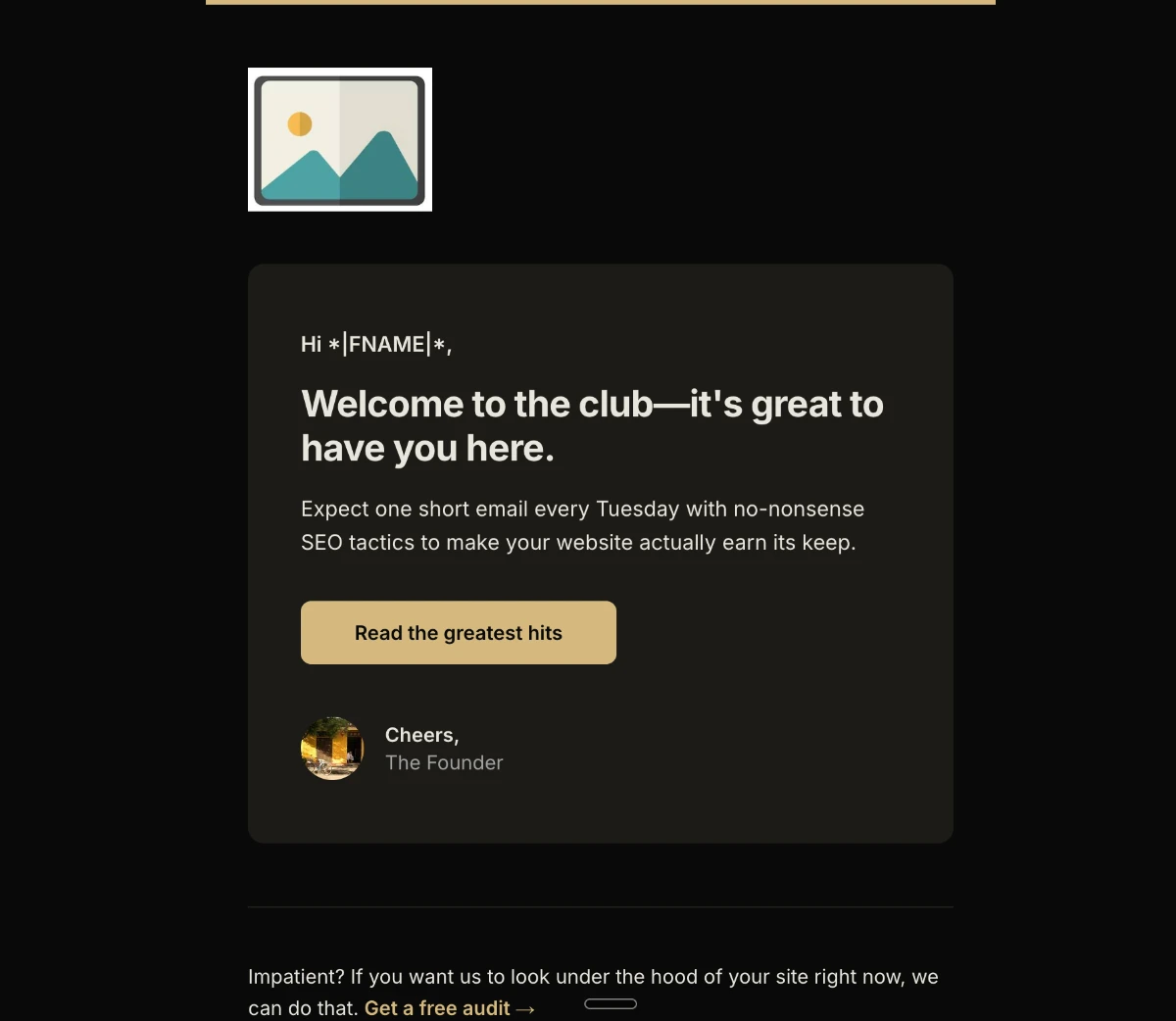
Really Good Emails notes that Casper’s welcome email works because it does exactly one job per screen: greet the new subscriber, say plainly what the brand does, back it with a row of press logos, then point at a single button. Glossier and Slack follow the same shape, single column throughout, one clear CTA, and social proof (customer photos, a founder note) as the only decoration rather than a second sales pitch. The reason this template travels so well across devices is structural: a single column has nothing to break when the screen narrows, since there’s no second column competing for the same width. If you’re picking one responsive email template to start from, a single-column welcome is the safest first build.
Two-column newsletter that stacks on mobile
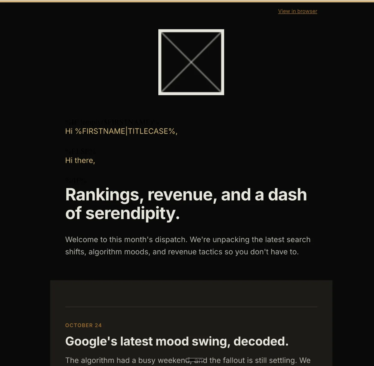
A newsletter built for responsive emails typically runs image-left and image-right cards side by side on desktop, alternating direction from one story to the next, then collapses each pair into a single stacked column the moment the screen gets narrow enough to be a phone. The structural reason this works: each card is a self-contained block, so a reader can skim one story, skip the next, and still get value from whichever block they stopped on, without needing the surrounding cards for context. This is the same logic behind Morning Brew’s editorial layout, bolding used sparingly to mark a transition rather than to decorate, and a stable section order so a returning reader doesn’t have to re-learn the template every send.
Product or promo email with one hero
The strongest promo and product-launch emails commit to one dominant hero image, one short value line explaining what’s new and why it matters, and a single button, resisting the urge to cram a grid of secondary offers underneath. Outfunnel’s teardown of martech sends flags the opposite move, a giant decorative header image at the top, as a genuine mistake: it pushes the actual offer and the CTA further down the page, which is a bigger problem on mobile where that extra scroll is more punishing than on desktop. If the hero doesn’t carry the offer itself, move the offer up rather than trusting the reader to keep scrolling past a picture to find it.
Templates vs Coding Your Own Responsive Email
There are four practical routes to a responsive email, and each one trades speed for control over cross-client rendering differently. The comparison below breaks down who each approach suits and what you give up.
| Approach | Best for | Speed | Control over rendering | Main trade-off |
|---|---|---|---|---|
| ESP drag-and-drop templates | Operators who want zero coding and will accept a generic look | Fast | Low, you’re locked into the ESP’s own rendering choices | Every sender on that ESP ships close to the same shell, so the email rarely feels distinct |
| Pre-built HTML template gallery | Teams that want a professional starting point without hand-coding from zero | Fast to medium (still needs customizing) | Medium, the underlying markup is fixed even if colors and copy are editable | A template picked from the same public gallery others are also picking from |
| Coding from scratch | Developers comfortable with table-based layout, VML, and Outlook-specific quirks | Slow | Highest, every tag and inline style is yours to set | Outlook’s Word rendering engine alone accounts for a large share of the debugging time, and dark mode adds another full pass |
| AI-generated hand-editable HTML | Operators who want a considered, on-brand result without learning email code or browsing a gallery | Fast, roughly one conversation | High, the output is real HTML you can edit line by line, not a black box | Still worth a quick cross-client check before a big send, same as any template |
When a template makes sense
A template, whether it’s your ESP’s drag-and-drop builder or a pre-built HTML gallery pick, makes sense when speed matters more than distinctiveness and you’re comfortable that your email will look close to what everyone else on that platform sends. Responsive email templates exist precisely to spare you from hand-coding media queries and table structures, and for a one-off transactional notice or a low-stakes internal update, that trade is often the right one. The catch shows up over time: since every sender pulls from the same limited set of templates, a list that receives email from several brands using the same ESP starts to notice the repetition, and that’s the moment a template stops feeling like a shortcut and starts feeling like a ceiling.
When to code it yourself
Coding from scratch makes sense when you (or someone on your team) already know the table-based layout, VML button, and dark-mode rules responsive email design depends on, and you need full control over how the markup behaves across Outlook, Gmail, and Apple Mail. It’s the slowest path by a wide margin, since Outlook’s rendering quirks alone can eat a full afternoon of testing, but it’s also the only route with no ceiling on customization. For teams without that specialized skill on staff, describing the email you want and getting back production-ready HTML email that’s already dark-mode safe and hand-editable closes most of the gap between “fast but generic” and “fully controlled but slow,” without requiring anyone to learn table-based markup from scratch.
Next Steps for Your Responsive Emails
Getting started with responsive emails comes down to picking the path that matches your skills, then confirming it actually works before it hits a real inbox. Here’s the short version, sorted by who you are.
- If you’re comfortable in HTML: start with the fluid table backbone (
width="100%"plusmax-width:600px) and layer min-width media queries on top for the desktop enhancement. - If design isn’t your strength: start from a responsive template rather than coding from zero, and expect to still customize the parts that make it feel like your brand.
- Whichever path you take: always test dark mode and check the layout on both mobile and desktop before you send a campaign, since that’s the step most people skip and the one most likely to bite you.
If you’d rather skip the back-and-forth entirely, describe the email you want and generate a branded, dark-mode-safe template for free, then export it straight to your ESP.
Frequently Asked Questions
What is the difference between a responsive email and a mobile-friendly email?
A responsive email uses media queries and a fluid structure to actively resize and rearrange its layout based on the screen it’s opened on. A mobile-friendly email is simpler and uses larger fonts and buttons by default, but it’s static: the same layout shows up regardless of device, it just happens to be readable on a small screen. The distinction matters because you can design something for mobile without it actually being responsive.
What screen width should I use as my breakpoint?
600px is the standard default, and it’s tied directly to the 600px body width most email templates use. Setting the breakpoint at any other value, like 620px or 640px, creates a mismatch where a viewport between 601px and your chosen breakpoint still receives mobile styles applied to a desktop-width layout, producing broken padding.
Do media queries work in every email client?
No. Gmail webmail and several mobile clients strip out <style> blocks in specific contexts, which means any media queries living inside that block simply never fire. Because of this, a fluid table structure using percentage widths has to work as the fallback on its own, with media queries layered on top as an enhancement rather than the foundation.
How do I stop my responsive email from breaking in Outlook?
Build the layout entirely with nested HTML tables, since Outlook on Windows renders with Microsoft Word’s engine rather than a browser engine and doesn’t support CSS layout methods like flexbox or grid. Keep every horizontal row’s total width under 600px, since padding stacked on both a wrapper and an inner cell is a common way templates quietly overflow the container. For any rounded button, use a VML shape alongside a live link, since Word’s engine can’t draw CSS border-radius reliably on its own.
Does dark mode affect responsive email design?
Yes, and it’s worth treating as a standard part of the build rather than an edge case. Declare every zone’s background color twice, once as an HTML attribute and once as an inline style, so a recoloring client respects at least one of the two. Avoid pure white or pure black on large surfaces and body text, since both invert to harsh extremes once a client forces dark mode.
Do I need to code to make a responsive email template?
No. You can start from a pre-built responsive template and adjust colors and copy, or describe the email you want to an AI tool and get hand-editable HTML back without writing a line of code yourself. Coding from scratch is only necessary if you want full control over cross-client rendering and already have the skills to manage Outlook’s quirks directly.