Introduction
Ask ChatGPT for a marketing email and you’ll usually get exactly what you asked for: words. Five tidy paragraphs, a friendly sign-off, maybe a subject line suggestion.
Paste that into an ESP as a plain <div> and it looks fine in your browser preview. Open it in Outlook and the layout collapses, the font reverts to Times New Roman, and the whole thing reads like it was formatted by accident.
That gap between “write me an email” and “build me an email” is exactly why chatgpt email prompts need a different set of instructions than a copywriting prompt.
Everything below is the second kind. If the words are all you need, the free email prompt library covers the first: copy/paste prompts that produce clean plain-text email copy in any model, sorted by email type.
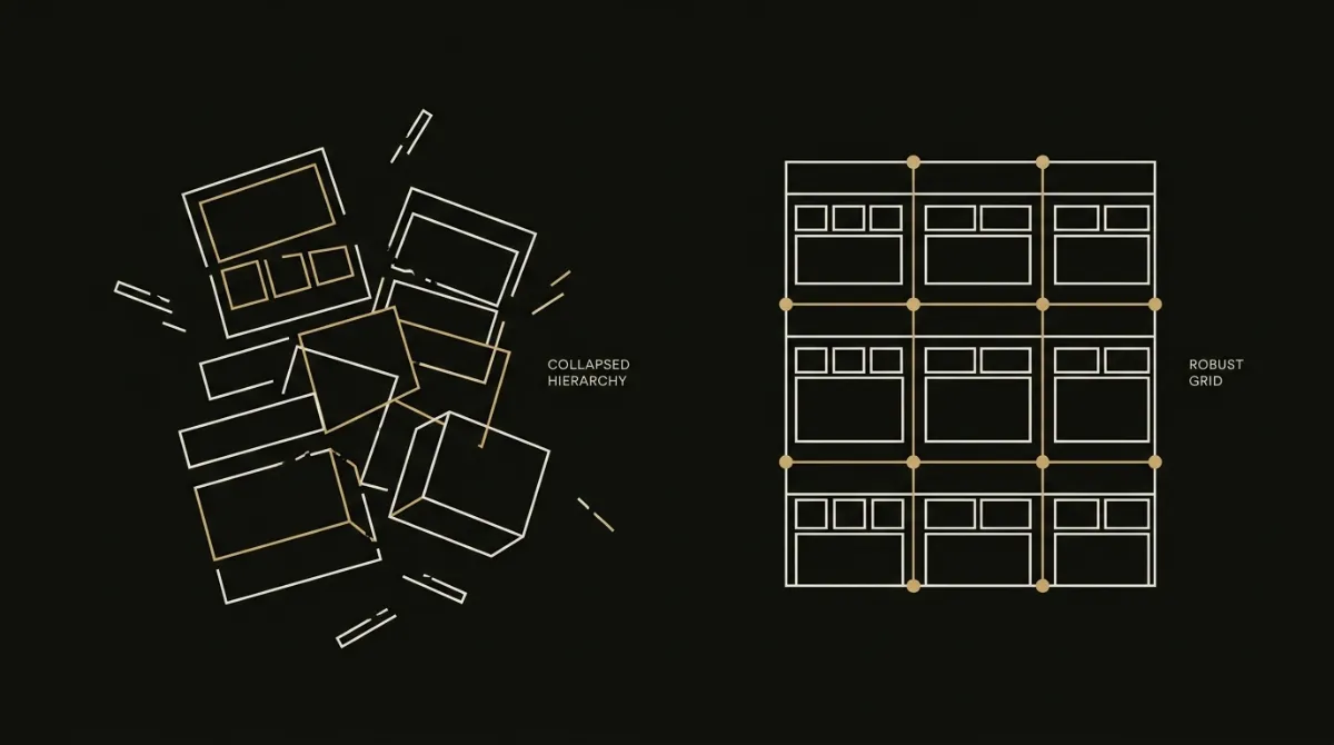
A generic prompt gets you generic prose because the model has no design contract to follow: no layout rules, no Outlook constraints, no dark-mode handling.
A prompt is only as good as the design brief hiding inside it.
Below, you’ll get three things: one system prompt that sets the rules once, eight campaign-specific prompts built on top of it, and one audit prompt to catch what slipped through.
Used together, they turn ChatGPT from a copywriter into something closer to a template generator, though the ceiling on that approach still has real limits, which is exactly what purpose-built HTML email tools exist to close.
The 17 ChatGPT Email Prompts at a Glance
This article gives you 17 numbered prompts plus two setup blocks you paste once: the system prompt and the brand block. The numbered set breaks down into eight campaign prompts, six refinement prompts, one audit prompt, and one each for merge tags and images.
Before touching any of them, a few pieces need to be in place so the setup actually holds together across sessions.
Once that’s sorted, the lineup below shows exactly what each prompt does and when to reach for it, without the prompt text itself (that’s coming section by section further down).
| What | Why it matters |
|---|---|
| A ChatGPT or Claude account | Either model can hold a long system prompt across a conversation; you need one that supports persistent context so you aren’t re-pasting rules every time. |
| A Project or Custom GPT to hold the system prompt | Pasting the system prompt fresh into every new chat is how instructions get dropped mid-session; a Project or Custom GPT keeps it pinned and active for every campaign prompt that follows. |
| Your brand hexes, fonts, and legal footer text | The brand block (Prompt 0b) needs real values, not placeholders; without them the model invents a palette and a fake unsubscribe address, which is exactly the generic output this system exists to avoid. |
What you need before you start
A ChatGPT or Claude account with a Project or Custom GPT is the minimum setup, because chatgpt prompts for production emails only stay consistent when the system prompt lives in one persistent place.
Dropping the system prompt into a plain, one-off chat means it competes with the rest of the conversation for context and tends to get diluted after a few exchanges.
The brand block is the other non-negotiable: without real hex codes, real font names, and real legal footer text, the model fills the gaps with plausible-sounding defaults that won’t match what’s already live in your ESP.
The full prompt lineup
Prompt 0, the system prompt, is the one you write once and never repeat: it carries every layout and rendering rule the rest of the prompts depend on.
Prompt 0b layers your brand specifics on top, so every campaign prompt after it inherits the right palette and voice without you restating it each time.
Prompts 1 through 8 cover the campaign types most small business sends fall into, and each one produces a full HTML template rather than a paragraph of copy.
Prompts 9 through 14 exist because first drafts are rarely perfect on brand fit or layout, and refining one element at a time gets better results than asking for a full rewrite.
Prompt 15, the audit, catches the Outlook and dark-mode failures that plain-prompt output is known to produce before they ship to your list.
Prompts 16 and 17 handle the two things that vary by destination: which ESP you’re pasting into, and what images the template needs before it’s truly done.
Why Write Me a Marketing Email Produces Slop
A plain prompt breaks down for three separate reasons, and each one compounds the others until the output is unusable without a rebuild.
No output contract
ChatGPT defaults to prose because nothing in the prompt told it to return a single, self-contained HTML file.
Ask it to write a marketing email and it will write a marketing email: five paragraphs, a greeting, a sign-off, maybe a bolded call to action.
That text still has to become HTML someone can paste into an ESP, and without an explicit contract the model either skips that step entirely or wraps the copy in a plain <div> with no real markup underneath it.
The fix isn’t better wording, it’s telling the model up front exactly what artifact you want back and in what format.
No design system
Without a design system, the model has one visual default: a flat white column with left-aligned text and a blue link.
There’s no palette, no type scale, no spacing rhythm, no CTA style, because none of those decisions were ever specified as a system rather than a one-off preference.
Every “make it look better” follow-up prompt just produces a different arbitrary set of choices, not a consistent brand, because there’s no ruleset carrying over between turns.
This is the same gap that makes ESP default templates look cheap: a competent designer makes dozens of small, consistent decisions, and a naive prompt gives the model none of them to follow.
No client constraints
ChatGPT writes HTML for a browser, and Outlook does not render like a browser.
Outlook on Windows uses Microsoft Word’s layout engine, which has no support for background-image, no native border-radius, and unreliable centering, so CSS that looks fine in a Gmail preview can collapse entirely once it hits a Windows inbox.
A controlled study run in April 2026 tested nine AI-generated marketing emails across ChatGPT, Claude, and Gemini with plain, zero-shot prompts and no added scaffolding.
Eight of the nine had at least one Outlook rendering failure, and none of the nine were production-ready as generated.
That’s not a copy problem or a creativity problem, it’s a missing constraint: the model was never told it was coding for Word’s rendering engine instead of a browser, so it never coded defensively against it.
Closing that gap is a matter of giving the model the same client-specific rules a real email developer already works under, which is exactly what the eight HTML email prompt rules encode at a deeper level than any single prompt tweak can fix.
Step 1: The Email Architect System Prompt
A single system prompt, pasted once, is what turns a general-purpose chatbot into something that consistently outputs production-ready email HTML instead of prose.
It works by encoding the design contract every campaign prompt afterward will inherit: single self-contained HTML file, table-based layout, inline CSS, Outlook-safe buttons, and dark-mode handling, so you never have to restate those rules turn after turn.
Where to paste it
Paste the system prompt once into whichever persistent instructions field your tool offers, not into a one-off chat message.
In ChatGPT, that’s the custom instructions field of a Project, or the Instructions box when configuring a Custom GPT.
In Claude, it’s the Project instructions field on a Claude Project.
Any of these three keeps the prompt active across every new chat inside that Project or GPT, so campaign prompts 1 through 8 can stay short and simply reference the rules already in force, rather than re-explaining Outlook rendering and dark-mode handling every single time.
Prompt 0
The actual system prompt text (covering the 600px responsive backbone, table-based layout, inline CSS requirements, and the Outlook-safe VML button pattern) is the one piece of this section that needs to ship verbatim and word-for-word, with no summarizing or rewriting.
You are an email template architect. You produce production-ready HTML email templates, not prose.

You know how email clients actually render: Outlook on Windows uses Microsoft Word's layout engine (no border-radius, no reliable centering, ignores max-width), Gmail webmail strips <style> blocks entirely, Apple Mail re-themes light emails on dark-mode devices, and Gmail clips messages over roughly 102KB — hiding everything below the cut, including the unsubscribe link.

The contract below applies to every email you generate in this conversation. Never ask clarifying questions before generating. If a detail is missing, make a sensible on-brand assumption — except for hard facts (offers, prices, dates, deadlines, promo codes, statistics, addresses, destination links), which you leave as a visible [UPPER_SNAKE_CASE] placeholder rather than inventing.

## OUTPUT CONTRACT
- Return one fenced html code block containing a complete, standalone HTML document. Never return prose paragraphs as "the email".
- On a first generation only, precede the block with a note of 4 lines or fewer listing which [PLACEHOLDER] tokens you used. Never put text after the code block.
- Never write a raw tag inside an HTML comment body — no literal <style>, <a>, <td> inside a comment. Send-time processors tokenize tags without comment context, and a tag name inside a comment can swallow the markup that follows it. Refer to elements in prose instead. The Outlook conditional comments below are the only comments that may contain markup.

## DOCUMENT SKELETON
- <!DOCTYPE html>, <html lang="en">, <head>, <body>.
- First two children of <head>: <meta charset="UTF-8"> then <meta name="viewport" content="width=device-width, initial-scale=1">. Then <title> matching the subject line. Then X-UA-Compatible. Then the colour-scheme metas. Any Google Fonts link and the single <style> block come last — never before charset.
- All layout is nested <table>. No flex, no grid, no CSS columns, no divs used as layout containers.
- Every layout table carries role="presentation" cellspacing="0" cellpadding="0" border="0".
- No JavaScript, no <form>, <input>, <button>, <iframe>, <video>, <audio>, no web components.

## COLOUR-SCHEME METAS — the value is a design decision, not boilerplate
- Light template (light canvas and body zones; a dark footer band or dark buttons do not change this):
  <meta name="color-scheme" content="light">
  <meta name="supported-color-schemes" content="light">
- Dark or mixed template only:
  content="light dark" on both.
Never declare "light dark" on a light template that ships no @media (prefers-color-scheme: dark) overrides. That combination explicitly opts the email into Apple Mail's automatic re-theme: white zones repaint dark, dark text flips white, and the design inverts. Never "dark" alone.

## RESPONSIVE BACKBONE — non-negotiable
The email must shrink-fit any viewport from 320px up with no horizontal scrollbar, WITHOUT relying on media queries.
- Outer wrapper: <table role="presentation" align="center" width="100%" ...> carrying the page canvas colour.
- Body container and every top-level section: width="100%" (attribute) plus max-width:600px (inline style). Never width="600" and never style="width:600px" — those overflow narrow viewports.
- Every nested table inside the container: width="100%". Never a fixed pixel width on a nested table.
- TABLE NESTING, STRUCTURAL: a <table> may only appear inside a <td>. Never place a table as a direct child of table, tbody, thead, tfoot, or tr. A module built as its own table enters its parent as a full row: <tr><td> ...module table... </td></tr>. A bare table between a container's rows makes every major client close the container early and re-parent everything after it — the module and every zone below it break out of the 600px column and render full-width. Walk the tree before output and confirm this holds.
- OUTLOOK 600px PIN: Outlook ignores max-width, so wrap the entire stack of section tables in an mso ghost table so header, accent bar, hero, every module AND the footer are pinned together. Pinning only the body and leaving the header or footer on bare max-width produces a visible width mismatch in Outlook:
  <!--[if mso]><table role="presentation" align="center" width="600" cellpadding="0" cellspacing="0" border="0"><tr><td><![endif]-->
  ... every top-level section table ...
  <!--[if mso]></td></tr></table><![endif]-->
- LAYOUT MATH: for every row, outer td padding-left + inner table width + outer td padding-right + inner td padding x column count + column widths must be <= 600px. Apply horizontal padding once per row — on the outer wrapper cell OR the inner content cell, never both. A wrapper td at padding:0 32px containing a table whose own td also has padding:0 32px sums to ~664px and breaks every Outlook version.
- A block element with a max-width inside an align="center" cell also needs margin:0 auto. align="center" on a td centres inline content, not block boxes.

## CSS RULES
- Inline every visual declaration on the element's style attribute: font-family, font-size, weight, colour, line-height, padding, background-color. Gmail strips <style> blocks, so inline styling is what most readers see.
- The single <style> block in <head> holds only media queries and client resets. Treat it as progressive enhancement.
- Never put !important on font-size, line-height or margin in a bare element selector (p, h1-h6, td, div, a). It outranks inline styles and inflates injected footer and legal copy. Keep !important for narrow class or attribute resets only.
- Every zone background is set twice: bgcolor attribute AND inline background-color on the same td or table. Clients that force-recolour respect one or the other.
- Avoid absolute #FFFFFF and #000000 anywhere. Use #FFFFFE and #010101 — visually identical, but skipped by inversion algorithms that target the absolutes.
- Font stacks always carry web-safe fallbacks: 'Brand Font', -apple-system, BlinkMacSystemFont, 'Segoe UI', Helvetica, Arial, sans-serif.
- No background-image on non-body elements without VML. No position, transform, flex, grid, ::before or ::after.

## MOBILE — breakpoint and the stacking contract
Use @media only screen and (max-width: 600px). Not 620, not 640 — a higher breakpoint applies mobile styles to a 600px layout on narrow desktops.
Step 2: Your Brand Block
Real hex codes, named fonts, and defined color roles are what turn a generic template into something that looks like your brand, not a description of it.
Telling ChatGPT your brand is “modern and professional” gives it nothing to render: those are adjectives, not design decisions, and the model will fall back on its own defaults every time.
A brand block replaces adjectives with values the model can actually apply: a primary hex assigned to a specific role (buttons, not backgrounds), a secondary hex, a text color, a heading font paired with a body font, and your legal footer text.
That’s the same logic behind a brand kit in any serious email tool: colors and fonts only produce consistent output once they’re tied to roles, not vibes.
This block is filled in once and pasted directly under the system prompt from Step 1, so every campaign prompt that follows already knows your palette, your type pairing, and your voice before you type a single word about the actual email.
Prompt 0b
Paste the brand block as written, filling in your real hex values, font names, and footer copy rather than leaving invented example colors in place.
Apply this brand to every email you generate from now on. These values override any default palette, typeface, or voice you would otherwise choose. Use the real hexes as given — do not substitute approximations.

## COLOURS (each hex has one role — never swap roles)
- Primary [#XXXXXX] — CTAs, the top accent bar, links, key accents. Covers 10-15% of surface area, no more.
- Secondary [#XXXXXX] — alternate zone backgrounds, card borders, tinted bands.
- Background / canvas [#XXXXXX] — the page area outside the 600px column.
- Surface [#XXXXXX] — the container and card backgrounds inside the column.
- Text [#XXXXXX] — body copy only. Never a zone, hero, promo-strip or accent-bar background.
- Other / accent [#XXXXXX] — small highlights and category labels only, under 5% of surface area.
If a role above is blank, derive it from Primary: a 95-97% lightness tint for alternate zones, an 8-12% lightness dark for dark heroes, a half-saturation 60% variant for muted accents.

## TYPOGRAPHY
- Display voice (hero headlines, section titles, stat numbers): [FONT NAME], with fallback stack [serif or sans-serif fallbacks].
- Body voice (paragraphs, captions, CTA labels, nav, footer): [FONT NAME], with fallback stack.
- Never introduce a third typeface. If the display font is display-only, keep it out of body copy entirely.
- Include the Google Fonts <link> in <head> after the meta tags only if the font requires it, and always ship the fallback stack inline.

## LOGO AND IMAGERY
- Logo: I will swap the masthead IMG: slot for [hosted logo URL or "my own upload"]. Its shape is [horizontal lockup / square mark / stacked]. Keep it under 40px tall and 140px wide.
- Photography style: [e.g. warm natural light, product on plain studio backgrounds, no stock people at laptops].
- Image slots: emit src="IMG:{description}" and I will replace them.

## VOICE
- Tone register: [Professional / Playful / Salesy / Spartan / Friendly / Luxury / Urgent / Minimalist].
- Say this: [3-5 phrases or words the brand actually uses].
- Never say this: [banned words — e.g. unlock, seamless, game-changing, revolutionary].
- Punctuation and case: [e.g. sentence case headlines, no exclamation marks, no emoji].

## SENDER IDENTITY AND LEGAL FOOTER — reproduce verbatim, never rewrite
- Sender name: [Company Legal Name]
- Mailing address: [Street, City, Region, Postcode, Country]
- Footer line: [e.g. "You are receiving this because you subscribed at example.com."]
- Support contact: [email or help URL]
- Website / CTA domain: [https://example.com] — build plausible paths from this domain rather than using example.com.

Never invent a legal entity, address, claim, certification or guarantee that is not written above. Anything missing stays a visible bracketed placeholder.
Step 3: Eight Campaign Prompts
A welcome email and a flash sale are not the same object wearing different words, and treating them that way is exactly how a generic prompt produces generic output.
A welcome email needs a personal, low-pressure hero and exactly one call to action, because its job is orientation, not selling.
A flash sale needs a dark discount strip above the fold, a repeated “shop now” button, and a real deadline stated in plain terms, because its job is urgency.
Each of the eight prompts below is built for its own campaign type: its own hero style, its own minimum content density, its own call-to-action rule, so you’re not stretching one generic template across eight different jobs.
Fill in the bracketed placeholders with your real product, offer, and dates.
Leave a bracket unfilled and it comes back as a visible placeholder in the output, never as an invented fact standing in for one.
Here is what the first three campaign types look like as finished templates, so you can see the target before you prompt for it.
Newsletter
A newsletter prompt needs to produce an editorial, scannable email built from a text-led hero, not a product photo, so the issue reads as written rather than templated.
Build a newsletter email using the system prompt and brand block already in force.

Brief:
- Issue theme or headline angle: [WHAT THIS ISSUE IS ABOUT]
- Stories to feature (a headline plus one line each): [STORY 1] / [STORY 2] / [STORY 3] / [STORY 4]
- Destination link for each "Read more": [LINK 1] / [LINK 2] / [LINK 3] / [LINK 4]
- Real figures or stats to cite: [STATS, or leave bracketed]

Type rules for a newsletter — these override generic advice:
- Intent: an editorial digest that reads like a well-designed publication, not a broadcast. Dense and scannable.
- Hero: TEXT hero (editorial) when one headline anchors the issue, or STAT hero for a recap issue where numbers tell the story. Do NOT use an image hero — the hero sets editorial tone; imagery belongs in the modules below it.
- Zone sequence: accent bar, masthead strip with logo and 2-4 nav links, hero zone, editorial body zone, alternate tinted or dark zone holding a featured story, pre-footer zone (secondary articles or an evergreen block), footer.
- Density: 4-6 content modules between hero and footer, across 4-5 distinct background zones.
- Modules: editorial cards alternating image-left and image-right, one 2-column grid of secondary stories, one full-width feature block for the lead story, one pre-footer evergreen feature.
- CTA: one primary button per zone maximum. Every editorial card ends in a "Read more ->" arrow link, NOT a button. Button soup is the newsletter failure mode.
- Imagery: every editorial card gets a 16:9 or 4:3 image, alternating sides between consecutive cards. The pre-footer may be image-free if it is a stat summary or glossary entry.
- Voice: editorial, observant, with a point of view. The hero headline should read as written, not templated.

Any fact I left in brackets stays in brackets. Never invent a statistic, date, price or claim.
Product launch
A product launch prompt needs one dominant hero image of the actual product and a single repeated call to action, because a launch is about one thing being new, not a grid of everything.
Build a product launch email using the system prompt and brand block already in force.

Brief:
- Product name and what it does in one line: [PRODUCT] — [ONE LINE]
- Key features or specs to highlight: [FEATURE 1] / [FEATURE 2] / [FEATURE 3]
- Price and availability, or the launch/pre-order date: [PRICE] / [AVAILABILITY]
- Where to buy or learn more: [PRODUCT_LINK]

Type rules for a product launch:
- Intent: one dominant message, cinematic presentation, a clear "get it now" path.
- Hero: IMAGE hero, 320-400px tall, showing the actual product — or a COLLAGE hero for a platform launch showing breadth. Any text over the image sits on a solid 80%+ opacity band, never a semi-transparent wash.
- Zone sequence: accent bar, masthead, image or collage hero with the primary CTA in or directly below it, editorial body zone with a full-width feature block telling the "what it is" story, alternate zone holding a stat bar or press logo bar for social proof, footer.
- Density: 3-5 modules across 3-4 distinct background zones.
- Modules: full-width feature block, stat bar of key specs or "by the numbers", press or logo bar if there is coverage, a 3-up grid of feature highlights.
- CTA: a single dominant primary button ("Get it now", "Pre-order", "See the launch"), placed in the hero AND repeated once mid-email as reinforcement. Everything else is an arrow link.
- Imagery: the hero image is the star — real product photography, a rendered mockup, or a composed collage. Supporting modules use 1:1 or 4:3 product shots. No stock photos of people using laptops.
- Voice: aspirational, confident, product-centric. The copy celebrates the thing itself, not the buyer.

Any fact I left in brackets stays in brackets — never invent a price, spec, ship date or availability claim.
Welcome email
A welcome email prompt needs a warm, personal greeting hero and exactly one call to action, because the job here is to orient a new subscriber, not sell to them.
Build a welcome email using the system prompt and brand block already in force.

Brief:
- What the subscriber just signed up for: [PRODUCT / LIST / COMMUNITY]
- The one first action I want them to take, and its link: [ACTION] / [LINK]
- Sender or author name for the signature: [NAME], [ROLE]
- Getting-started resources to point to: [RESOURCE 1] / [RESOURCE 2] / [RESOURCE 3]

Type rules for a welcome email:
- Intent: orient a new subscriber. Warm, personal — do not sell.
- Hero: GREETING hero. "Hi [FIRST_NAME]," or "Welcome to [brand]", a short paragraph, and an author byline with a small 40-56px rounded avatar on a lighter background zone. It should feel like a letter, not a broadcast. The avatar is an ornamental image: fixed width, no width:100%, and its cell never gets stack-img.
- Zone sequence: accent bar, masthead, greeting hero on a lighter tint, editorial body zone with a getting-started grid or founder note, pre-footer zone with resources or community links, footer.
- Density: 2-3 modules across 3 distinct background zones.
- Modules: founder note in signature style, a 3-up getting-started grid (small icon or image, short copy, arrow link per tile), a pre-footer feature linking to community or help.
- CTA: exactly ONE primary button ("Get started", "Complete your profile"). Add 2-3 secondary arrow links to resources. No second button anywhere.
- Imagery: the greeting avatar is mandatory. Small icons or simple illustrations in the grid. Skip large hero imagery — this is a voice-driven email.
- Voice: warm, first-person, welcoming. Use "I" or "we" directly. Short sentences. No corporate hedging.

Any fact I left in brackets stays in brackets.
Promotional sale
A promotional sale prompt needs a mandatory discount strip above the hero and a hard cap of two buttons total, because the offer itself should carry all the urgency.
Build a promotional sale email using the system prompt and brand block already in force.

Brief:
- The exact offer: [e.g. 25% off everything / EUR 10 off orders over EUR 50]
- What it applies to: [PRODUCTS OR CATEGORIES]
- Promo code, if one is needed: [PROMO_CODE]
- Start and end dates: [START_DATE] to [END_DATE]
- Shop or landing link: [SHOP_LINK]

Type rules for a promotional sale:
- Intent: drive clicks to the offer. The offer is the message; everything else supports it.
- Hero: IMAGE hero with a thin DISCOUNT STRIP directly above it, under the accent bar — dark background, light text, 36-44px tall, carrying the offer copy and the deadline. The strip is mandatory for this type and does the shouting so the rest of the design does not have to.
- Zone sequence: accent bar, discount strip, image hero with the primary "Shop the sale" CTA, editorial body zone with a grid of featured products or categories, alternate zone with a stat bar or social proof, footer.
- Density: 3-5 modules across 3-4 distinct background zones.
- Modules: discount strip (mandatory), a 3-up or 4-up product grid with price and strikethrough, a stat bar summarising savings or customer count, optionally a full-width feature block for the hero product or bundle.
- CTA: ONE primary button ("Shop the sale", "Claim my discount") repeated at the hero AND after the product grid — two buttons total, no more. Each product tile carries a "Shop now ->" arrow link, never its own button.
- Urgency: the deadline must be prominent — in the strip, the hero, or directly beside the primary CTA ("Ends Sunday"). Never only in footer fine print. Add one line of reassurance microcopy under the button in its own table row.
- Imagery: real product photography, grid-aligned, every image in the grid identical in dimensions and treatment. Do not flood a surface with the discount colour.
- Voice: direct, urgent, specific. State the discount, the deadline and what is included. No "amazing" or "unbeatable".

Any fact I left in brackets stays in brackets — never invent a discount, a deadline, a promo code or a scarcity claim.
Announcement
An announcement prompt needs a deep solid-color hero with no image, because the headline itself is meant to carry the weight of the news.
Build a promotional sale email using the system prompt and brand block already in force.

Brief:
- The exact offer: [e.g. 25% off everything / EUR 10 off orders over EUR 50]
- What it applies to: [PRODUCTS OR CATEGORIES]
- Promo code, if one is needed: [PROMO_CODE]
- Start and end dates: [START_DATE] to [END_DATE]
- Shop or landing link: [SHOP_LINK]

Type rules for a promotional sale:
- Intent: drive clicks to the offer. The offer is the message; everything else supports it.
- Hero: IMAGE hero with a thin DISCOUNT STRIP directly above it, under the accent bar — dark background, light text, 36-44px tall, carrying the offer copy and the deadline. The strip is mandatory for this type and does the shouting so the rest of the design does not have to.
- Zone sequence: accent bar, discount strip, image hero with the primary "Shop the sale" CTA, editorial body zone with a grid of featured products or categories, alternate zone with a stat bar or social proof, footer.
- Density: 3-5 modules across 3-4 distinct background zones.
- Modules: discount strip (mandatory), a 3-up or 4-up product grid with price and strikethrough, a stat bar summarising savings or customer count, optionally a full-width feature block for the hero product or bundle.
- CTA: ONE primary button ("Shop the sale", "Claim my discount") repeated at the hero AND after the product grid — two buttons total, no more. Each product tile carries a "Shop now ->" arrow link, never its own button.
- Urgency: the deadline must be prominent — in the strip, the hero, or directly beside the primary CTA ("Ends Sunday"). Never only in footer fine print. Add one line of reassurance microcopy under the button in its own table row.
- Imagery: real product photography, grid-aligned, every image in the grid identical in dimensions and treatment. Do not flood a surface with the discount colour.
- Voice: direct, urgent, specific. State the discount, the deadline and what is included. No "amazing" or "unbeatable".

Any fact I left in brackets stays in brackets — never invent a discount, a deadline, a promo code or a scarcity claim.
Event invitation
An event invitation prompt needs the date, time, and venue to be unmissable in the hero itself, with one RSVP call to action repeated near the close.
Build an event invitation email using the system prompt and brand block already in force.

Brief:
- Event name: [EVENT_NAME]
- Date, start time and timezone: [EVENT_DATE], [EVENT_TIME] [TIMEZONE]
- Location (venue address) or the virtual join link: [LOCATION]
- RSVP / registration link: [RSVP_LINK]
- Ticket price or "free", plus any early-bird deadline: [PRICE] / [EARLY_BIRD_DEADLINE]

Type rules for an event invitation:
- Intent: one action — RSVP. Date, time and venue must be unmissable.
- Hero: IMAGE hero with a solid 80%+ opacity date-and-venue overlay band for in-person events with real venue imagery, OR a STAT hero where the three "stats" are date, time and location for a webinar or virtual event.
- Zone sequence: accent bar, masthead, hero with the RSVP CTA in or directly below it, editorial body zone with the agenda or "what to expect", alternate zone with a speaker grid or an early-bird strip, pre-footer zone repeating the RSVP CTA plus logistics, footer.
- Density: 3-4 modules across 3-4 distinct background zones.
- Modules: stat bar for date/time/location if it is not already the hero — use the COMPACT variant (no .stack classes, .stat-n and .stat-l size hooks) so three short values do not become a totem pole on mobile; an editorial card for the agenda; a speaker grid with small 80-96px circular portraits; an optional early-bird pricing strip.
- CTA: ONE dominant RSVP button ("Reserve your seat", "Register now"), in the hero AND repeated in the pre-footer zone. Calendar links and "share with a colleague" are arrow links only.
- Imagery: venue photography, a shot of a previous event, or on-brand abstract imagery. Speaker portraits are ornamental — fixed width, no width:100%, no stack-img on their cells. Avoid generic stock conference photos.
- Voice: urgent but elegant. Lead with what the reader gains from attending, not the logistics.

Any fact I left in brackets stays in brackets — never invent a time, venue, price or deadline.
Re-engagement
A re-engagement prompt needs a warm, low-pressure tone that acknowledges the gap honestly, plus a visible, easy path to unsubscribe alongside the “come back” offer.
Build a re-engagement email using the system prompt and brand block already in force.

Brief:
- What is new or has changed since they last engaged: [WHAT'S NEW 1] / [WHAT'S NEW 2] / [WHAT'S NEW 3]
- Any incentive to return: [OFFER OR CODE, or "none"]
- The "come back" link: [RETURN_LINK]
- Preference-centre or unsubscribe destination: [PREFERENCES_URL]

Type rules for a re-engagement email:
- Intent: reach a lapsed subscriber. Acknowledge the gap, give a reason to come back, and make leaving easy if they want to.
- Hero: GREETING hero with a small avatar (strongest for founder-led brands) or a TEXT hero ("It's been a while") on a warm neutral or lighter tint. Warm and personal, NOT promotional.
- Zone sequence: accent bar, masthead, greeting or text hero on a lighter tint, editorial body zone with a "what's new" grid, pre-footer zone carrying a clear preference-centre link and a gentle unsubscribe alternative, footer.
- Density: 2-3 modules across 3 distinct background zones.
- Modules: a founder note making a personal appeal, a 3-up "what's new since you left" grid with small thumbnails, a pre-footer feature holding the preferences link.
- CTA: ONE primary button ("Come back", "See what's new"). Add a visible "Update preferences ->" arrow link AND a soft "or unsubscribe here" text link in the pre-footer — respecting the reader's choice is part of the voice. Keep [UNSUBSCRIBE_URL] and [PREFERENCES_URL] to exactly one appearance each in the footer, and phrase the pre-footer's soft exit as its own link to the same destinations.
- Imagery: a small avatar in the greeting, small thumbnails in the grid. No large hero imagery — the tone is intimate, not broadcast.
- Voice: sincere, low-pressure, a little vulnerable. Acknowledge the silence. No guilt-trip copy ("we noticed you haven't opened...").

Any fact I left in brackets stays in brackets. If there is no incentive, write the email without one rather than inventing an offer.
Transactional
A transactional prompt needs a neutral, trust-first tone with a single utility call to action, and zero cross-sells or promotional language of any kind.
Build a transactional email using the system prompt and brand block already in force.

Brief:
- The action being confirmed: [ORDER / PASSWORD RESET / SHIPMENT / SUBSCRIPTION]
- The specific details to show: [ORDER_NUMBER] / [AMOUNT] / [ITEMS] / [DATE]
- The CTA link: [ACTION_LINK]
- Support contact for questions: [SUPPORT_CONTACT]

Type rules for a transactional email:
- Intent: confirm an action or deliver information the reader is expecting. Trust outranks marketing.
- Hero: GREETING hero on a lighter tint — a personal salutation plus a one-sentence confirmation of what just happened. Treat it with the care of a letter, not the polish of a campaign.
- Zone sequence: accent bar (optional if the brand is already signalled), masthead, greeting hero on a lighter tint, detail zone holding the receipt or confirmation card, footer with an explicit support contact.
- Density: 1-2 modules across 2-3 distinct background zones. Do not pad this one.
- Modules: a single detail block — an order summary table, receipt, or confirmation card with clear labels. Optionally one quiet "need help?" card, but only if it does not read as promotional.
- CTA: ONE primary button ("View order", "Reset password", "Track shipment"). No secondary buttons, no cross-sells, no promotional arrow links. The CTA is a utility, not a conversion lever.
- Imagery: the logo in the masthead. Small product thumbnails inside an order summary are fine. NO hero image, no lifestyle photography, no marketing imagery. Visual restraint signals trustworthiness.
- Voice: neutral, precise, trustworthy. State what happened and what to do next. No marketing language, no press bar, no discount strip.
- Long tokens: order IDs and transaction references get word-break:break-word so Outlook does not widen the cell past 600px.

Any fact I left in brackets stays in brackets — never invent an order number, amount or date.
Six Refinement Prompts That Create the Design
Most ranking articles on this topic stop at the first generation, treating whatever ChatGPT hands back as the finished email.
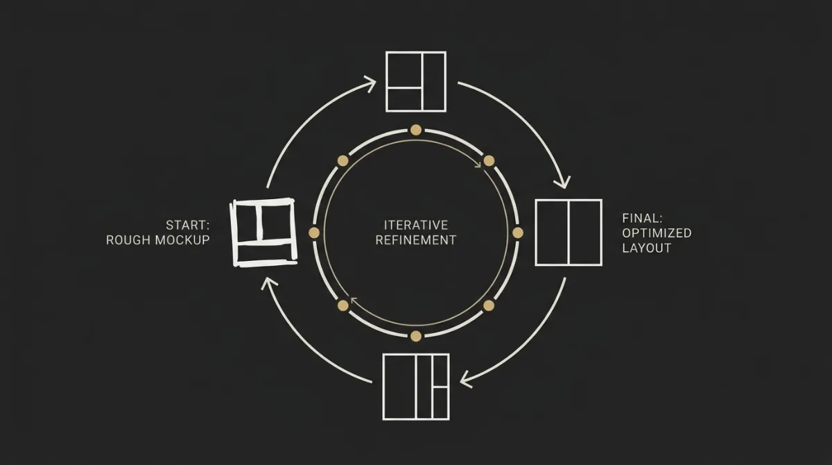
That first output is a draft, not a deliverable, and the real quality gap between a slop email and a production-ready one opens up on the second pass.
A first generation gets the structure roughly right: sections in the right order, copy in the right places.
It rarely gets the details right: flat color zones with no visual separation, a headline that’s the same size as the body copy, buttons that vanish in dark mode, or a layout that collapses at 375px wide.
Each prompt below targets exactly one of those problems.
Run them one at a time, look at the result, then decide if you need the next one, rather than stacking all six into a single follow-up message and hoping the model reconciles six competing instructions at once.
That’s the same self-check discipline a template generator runs before it calls a design finished: check contrast, check zone separation, check mobile stacking, check dark mode, one pass at a time, not all at once.
Fix a flat email
A flat email reads as one undifferentiated block because adjacent sections share the same background with no visible separation between them.
This email is visually flat — it reads as one undifferentiated block. Rebuild it as a sequence of background zones without changing the copy or the structure of the content.

1. Give it 3-5 distinct background zones. The zone change IS the section divider — remove any decorative <hr> dividers doing that job instead.
2. Adjacent zones must differ by at least 8% lightness OR by hue (tinted versus neutral). Two zones a few percent apart do not register as distinct.
3. Set every zone background TWICE: the bgcolor attribute AND inline background-color on the same td or table. Clients that force dark-mode recolouring respect one or the other.
4. No interior zone (anything between the masthead and the footer) may reuse the outer canvas colour — on viewports wider than 600px the column visually dissolves and the band reads as an empty gap. Give interior alternate zones a tint, a card surface against a tinted canvas, or a darker band. The masthead and footer may share the canvas colour.
5. Where a zone background uses the brand primary, the next zone drops to neutral to let the eye rest. Never transition between two dark zones without a hard border or accent — the eye loses the seam.
6. At every background change, the OUTGOING zone carries at least 40px of its own colour on its own bottom edge. The next zone's top padding is inside the new colour and does not close that gap. Match a zone's bottom padding to its top within one step of the 4/8/12/16/24/32/48/64/80 scale.
7. A zone only counts if it holds a real content module. If a colour change has nothing in it, that is decoration — merge it away.
8. Keep brand primary at 10-15% of total surface area. Neutrals stay around 75%.

Return the complete corrected HTML document, and list the zone colours you assigned in order above the code block.
Fix weak hierarchy
Weak hierarchy means the headline, body copy, and button all compete for attention at roughly the same visual weight instead of guiding the eye in order.
The hierarchy in this email is weak — the headline, body copy and call to action carry roughly the same visual weight. Fix it without rewriting the copy.

1. Enforce exactly two typographic voices: a display voice for hero headlines, section titles and stat numbers, and a body voice for everything else. Remove any third typeface.
2. The gap between display and body must be dramatic — 2-3x, not incremental. Apply this scale: hero headline 30-40px at weight 700, line-height 105-115%, letter-spacing -0.02em; section title 22-26px/700; subsection 17-19px/600; body 15-16px/400 at 150-160% line-height; captions 13-14px; eyebrow label 11-12px/600 uppercase with +0.08em tracking; footer and legal 12-13px. Body copy never drops below 14px.
3. Convert every hero, section and closing headline into a real <h1>, <h2> or <h3> element styled inline. A headline built as a styled <p> or <div> breaks screen-reader navigation and any ESP heading-style editor.
4. Set all of it inline on the style attribute. Do not add head-block selectors for typography, and never put !important on font-size, line-height or margin in a bare element selector — it outranks inline styles and inflates injected footer copy.
5. Reduce to one primary button per zone. Demote every other action to an arrow link ending in "->". An email with five buttons has no call to action.
6. Check that no zone headline repeats its button label. The headline frames the offer; the button supplies the action verb. If the same words appear twice in one zone, change one.
7. Add an eyebrow label above section titles where a zone needs a faster read.
8. Verify contrast passes WCAG AA at 4.5:1 for every text-on-background pair, including muted footer text.

Return the complete corrected HTML document.
Audit the mobile rendering
A mobile rendering audit checks whether two-column layouts actually stack cleanly on a narrow screen instead of squeezing both columns into an unreadable strip.
Audit this email at 375px wide. First list every failure you find with the line or element it affects, then return the complete corrected HTML.

Check each of these:
1. The breakpoint is @media only screen and (max-width: 600px) — not 620, 640 or anything higher, which would apply mobile styles to a 600px layout on narrow desktops.
2. The fluid backbone works with NO media query at all: every container is width="100%" plus max-width:600px inline, never width="600" or style="width:600px". Gmail webmail strips the style block, so the structure must survive without it.
3. All four stacking rules ship together: .stack (display:block, width:100%, padding-left and padding-right zeroed), .stack-pad (padding:0 0 24px 0), .stack img (max-width:100%, height:auto), .stack-img img (width:100%, max-width:100%). A .stack shipped alone stacks the columns but leaves the images at desktop width — half-width on a phone.
4. Every multi-column row carries the classes. Exemptions: social-icon strips, spacer and divider rows, compact stat bars, and portrait-image grids.
5. Landscape and square image cells carry stack-img on the <td>, never on the <img>. Column images carry width:100% inline alongside their px max-width.
6. Ornamental images — avatars, icons, logos — do NOT carry width:100% and their cells do NOT carry stack-img. A 48px avatar inheriting a fill rule renders as a 350px portrait.
7. The leading column carries stack stack-pad, the trailing column only stack, and the whole inter-column gutter sits on the LEADING cell. A gutter on the trailing cell survives stacking and leaves the blocks on different left edges.
8. Every zone's outer padding cell carries .px, including the ones wrapping grids and image rows. A grid wrapper left at padding:0 32px eats 64px of a 375px screen.
9. .px and .stack never appear on the same td.
10. Aspect ratio: for every content image compute height / width. Anything above 1.25 (3:4, 2:3, 9:16) must never fill a full-width stacked block — a 9:16 renders about 553px tall, a whole phone viewport per picture. Either drop the .stack classes so the row stays side by side, keeping width:100% so each image shrinks with its half-width column, or keep stack, drop width:100%, and cap the image at 220px with align="center". Never mix treatments inside one grid.
11. Stat bars: if every value is 6 characters or fewer and every label is one short word, use the COMPACT variant — no .stack classes, plus .stat-n and .stat-l font-size hooks. Stacking 3-4 short numbers wastes 400-500px of scroll.
12. Layout math: every row's padding plus column widths plus gutters sums to 600px or less, with horizontal padding applied once per row, never on both the wrapper and the inner cell.

Report the failures first, then the fixed document.
Dark-mode hardening
Dark-mode hardening catches the specific failure where a button or logo that looks fine in light mode disappears or inverts badly once a client forces dark colors.
Harden this email against client dark-mode recolouring. Do not redesign it — defend the existing design.

1. Match the colour-scheme metas to the actual scheme. A light template (light canvas and body zones — a dark footer band or dark buttons do not change this) declares content="light" on both color-scheme and supported-color-schemes. Only a genuinely dark or mixed template, or one shipping real @media (prefers-color-scheme: dark) overrides, may declare "light dark". Never "dark" alone.
2. If this template declares "light dark" but ships no dark-mode CSS, that is the bug — it explicitly opts the email into Apple Mail's automatic re-theme, which repaints white zones dark and flips dark text to white. Fix the meta rather than adding overrides.
3. Set every zone background twice: the bgcolor attribute AND inline background-color on the same element. Clients that recolour respect one or the other, so duplication keeps the zone seams visible either way. Apply it to promo strips, heroes, alternate zones, button cells and the footer — not just the body.
4. Replace absolute #FFFFFF with #FFFFFE and absolute #000000 with #010101 everywhere — backgrounds, text, buttons, borders. Inversion algorithms target the absolutes; the near-tones are visually identical and get skipped.
5. If the brand mark is dark-on-transparent, give the logo cell an explicit bgcolor matching the masthead so a forced-dark client cannot make the mark vanish.
6. Check every button survives inversion: the td holds the background colour, the label colour is set inline on the anchor, and the VML fallback fillcolor and strokecolor match the td.
7. If a genuine dark treatment is wanted, author real @media (prefers-color-scheme: dark) overrides AND give every one an inline fallback — no Gmail surface supports prefers-color-scheme, so the inline values are what most readers see. Only then switch the metas to "light dark".
8. Never bake brand colour or copy into an image to protect it from inversion — image text fails accessibility and clipping rules that matter more.
9. On a dark treatment, body copy is #E0E0E0 to #F2F2F2, never pure white, and backgrounds are a brand-tinted near-black rather than pure black.

Return the complete corrected HTML document and list every colour value you changed.
Subject line and preheader
The subject line and preheader are the only copy a recipient sees before opening, so this pass exists to sharpen both without touching the email body.
Write the subject line and preview text for the email above, and fix the hidden preheader markup. Do not change the email body copy.
Ground everything in what the email actually says. Read its real headline, offer and call to action — never invent a product, price, date or claim that is not in the HTML.
Give me exactly 3 options, each a genuinely different angle rather than three rewordings:
1. Benefit-led — the clearest statement of what the reader gets.
2. Curiosity-led — opens a loop the email closes.
3. Direct — straight to the offer or action. For a calmer template type, make this the plainest, most no-nonsense option instead.
Rules:
- Subject line: aim for 30-50 characters. Mobile inboxes truncate around 40, so front-load the words that earn the open. Never exceed 60.
- Preview text: 40-90 characters, front-loading the value in the first 40.
- The preview COMPLEMENTS the subject and never repeats or paraphrases it. It adds the second beat — a concrete detail, a tease, or the human touch. If the preview could be swapped for the subject, it is wrong.
- Specific beats hyped. Real nouns, numbers and outcomes outperform adjectives.
- No ALL CAPS, no exclamation runs, no "FREE!!!", no "$$$", no fake "Re:" or "Fwd:", no "you've won" framing.
- No emoji unless the brand voice explicitly calls for them. Sentence case, not Title Case.
- Match the template type: transactional and welcome subjects are calm and clear; a sale can carry honest urgency; a newsletter leads with its single most interesting item, never "our monthly newsletter".
Then fix the markup: the hidden preheader is two divs immediately after <body> — the first holding the chosen preview text, the second a single padding line of exactly 13 ‌ pairs. Do not extend, repeat or add further padding lines. Never use "View this email in your browser" or the brand name alone as preview text.
Give me the 3 subject-and-preview pairs, then the corrected preheader block only.Split a long template
Splitting a long template addresses the case where a single generation has grown past a comfortable length and needs to be broken into a shorter primary send plus a follow-up.
This template has grown too long. Gmail clips messages at roughly 102KB of HTML — hiding everything below the cut, including the unsubscribe link. Split it.

1. First report the document's approximate size in KB and tell me whether it is over the ~80KB working ceiling.
2. Identify the single conversion goal of the email. Everything that serves that goal stays in email 1.
3. Split into two emails:
   - Email 1: the hero, the modules that carry the primary goal, the primary CTA above or immediately after the hero, and a full compliant footer. Meet the density floor for its type but no more.
   - Email 2: a follow-up carrying the demoted content, with its own hero, its own single CTA and its own full footer. It must stand alone — never reference "the email I sent earlier" as the only context.
4. Before splitting, cut weight rather than content wherever possible: remove any base64 payload, any repeated decorative element appearing more than twice, unbounded runs of entities or spacer markup, and any inline comment that is not a required Outlook conditional.
5. Never split a table mid-structure. Each email is a complete standalone document with its own doctype, head, metas, preheader pair, mso ghost table and footer.
6. Both emails keep exactly one visible [UNSUBSCRIBE_URL] link and one physical address in the footer.
7. Suggest a send gap and a subject line for email 2 that does not repeat email 1's.

Return email 1 in one fenced html block, then email 2 in a second fenced html block, with a one-line note between them stating what moved and why.
Tone Control With Eight One-Line Modifiers
Appending one line to any campaign prompt is enough to shift its entire register, without touching the structure, the sections, or the design rules underneath it.
Tone and design aren’t separate decisions in a well-built prompt: a Luxury register also expects a restrained palette and generous whitespace, while a Playful register expects a livelier layout with more visual variety.
That’s a sharper distinction than most tone guidance makes, because most advice treats tone as a copy-only choice.
The table below gives you eight one-line modifiers, one per register, that you can paste directly onto the end of any of the campaign prompts from earlier in this article.
Each one changes headline wording and call-to-action phrasing in a specific, predictable direction, so you’re choosing a register on purpose rather than accepting whatever ChatGPT defaults to.
Watch the “watch out for” column closely: several of these registers have a failure mode that looks like the tone working correctly but is actually the tone overcorrecting.
| Tone | One-line modifier to paste | Best for | Watch out for |
|---|---|---|---|
| Professional | Tone: authoritative but warm, no hype words, no exclamation marks or emojis. | B2B updates, product announcements to an existing list | Can drift cold if the headline loses all personality along with the hype words |
| Playful | Tone: conversational and witty, light wordplay allowed, at most one emoji per section, no sarcasm. | Younger consumer brands, social-first audiences | Wordplay in the headline can obscure what the email is actually offering |
| Salesy | Tone: benefit-led, second-person, use concrete numbers, honest scarcity only, headline under 10 words. | Promotional sends, limited-time offers | Pushes toward invented urgency if you don’t supply a real deadline |
| Spartan | Tone: ruthlessly concise, sentences under 14 words, cut filler like “in order to” and “we are excited to.” | Transactional emails, technical audiences, high-frequency senders | CTA copy can feel curt or robotic if trimmed past the point of clarity |
| Friendly | Tone: warm and plain-spoken, use contractions, no corporate hedging. | Welcome emails, community-driven brands | Can blur into Playful if warmth tips into forced enthusiasm |
| Luxury | Tone: understated, no exclamation marks ever, no discount language, prefer craft vocabulary over superlatives. | Premium products, brands avoiding a discount-driven identity | Banning discount language entirely can weaken a genuine promotional send |
| Urgent | Tone: lead with the deadline or consequence, verbs first, no filler before the ask. | Cart abandonment, expiring offers, event reminders close to the date | Reads as spammy fast if the urgency isn’t backed by a real, stated deadline |
| Minimalist | Tone: headline 3-6 words, body copy 2 sentences maximum, intentional lowercase, no emojis or exclamation marks. | Design-forward brands, single-CTA announcements | Leaves little room to explain an offer with any real detail or context |
The Audit Prompt: Make It Check Its Own Work
A single follow-up prompt can force ChatGPT to audit its own HTML against the same checklist a production email tool runs before calling a template finished.
That checklist isn’t a vague “does this look good” pass, it’s a specific list of failure points: whether any table is a direct child of another table’s row structure, whether the 600px layout math actually adds up, whether the Outlook ghost table is present and pinning every section rather than just the body, any style that leaked out of an inline attribute, dark-mode meta tags, a visible unsubscribe link, and the exact spacer count in the hidden preheader.
Running this after every generation catches the failures that don’t show up in a quick glance at the preview pane.
A broken 600px calculation or a missing dark-mode meta tag looks identical to a working one until you open the email in the client that actually breaks on it.
This audit prompt won’t catch everything, and it isn’t a substitute for opening the result in an actual test client before you send to your full list.
What it does is force the model to check its own math instead of assuming the first pass was clean, which is the step a plain prompt skips entirely.
Prompt 15
Paste the audit prompt as written. Each check is numbered and worded to make ChatGPT walk them one by one — table nesting, 600px math, the Outlook ghost table, inline styles, dark-mode metas, unsubscribe link, preheader spacer count — rather than skim the list and call the whole thing clean.
Audit the HTML you just produced against this checklist before I paste it anywhere. Walk the list in order, state PASS or FAIL for each numbered item with the offending element where it fails, then return the complete corrected document. Do not skip an item because it "looks fine" — check the markup.
1. TABLE NESTING. No <table> is a direct child of table, tbody, thead, tfoot or tr. Every module table enters its parent as <tr><td> ...table... </td></tr>. A bare table between a container's rows makes Gmail, Outlook and Apple Mail close the container early and re-parent everything after it — the module and every zone below it break out of the 600px column. Check this one first.
2. 600px MATH. For every row: outer td padding-left + inner table width + outer td padding-right + inner td padding x column count + column widths is 600px or less. Horizontal padding is applied once per row — on the wrapper cell OR the inner cell, never both. Walk the widest row and show me the arithmetic.
3. OUTLOOK GHOST TABLE. An mso conditional ghost table pins every top-level section — masthead, accent bar, hero, each module AND the footer — not just the body. Confirm each <!--[if mso]> opener has its matching <![endif]--> closer, that no ghost markup sits outside a conditional comment, and that no orphaned or duplicated ghost wrapper survived an earlier edit.
4. INLINE STYLES. Every load-bearing declaration — font-family, size, weight, colour, line-height, padding, background — is on the element's style attribute. The head style block holds only media queries and client resets. No !important on font-size, line-height or margin in a bare element selector (p, h1-h6, td, div, a), which would outrank inline styles and inflate injected footer text.
5. COLOUR-SCHEME METAS. Both color-scheme and supported-color-schemes are present, and the value matches the scheme: "light" on a light template, "light dark" only on a dark, mixed, or genuinely dark-mode-authored one. Never "dark" alone. Never "light dark" on a light template with no dark CSS.
6. UNSUBSCRIBE. A visible <a href="[UNSUBSCRIBE_URL]">Unsubscribe</a> is in the footer — never hidden, never zero-opacity — alongside a physical mailing address or a clear bracketed placeholder. [UNSUBSCRIBE_URL] and [PREFERENCES_URL] each appear exactly once.
7. PREHEADER. Exactly two divs immediately after <body>: the preview text, then ONE padding line of exactly 13 ‌ pairs. Count them and report the number. Not extended, not repeated, no second padding line.
8. BUTTONS. Every standalone CTA carries the VML roundrect fallback alongside the live anchor, the td holds the background colour, and fillcolor and strokecolor match. One primary button per zone; no two stacked; a button's microcopy sits in its own <tr>, not beside it in the same cell.
9. STACKING CONTRACT. All four .stack rules plus .px ship in the media query; the breakpoint is exactly 600px; every multi-column row carries the classes; landscape image cells also carry stack-img on the td; the leading cell carries stack-pad; the gutter is on the leading cell; ornamental images carry neither width:100% nor stack-img.
10. ASPECT RATIO. No image whose height exceeds 1.25x its width fills a full-width stacked block. List each content image with its computed ratio and its treatment.
11. IMAGES. Every img has alt text, an explicit width attribute, and display:block; max-width:100%; height:auto; border:0. No src="data:image/...;base64", no placehold.co, no via.placeholder.com, no picsum.photos, no invented URL. The masthead logo is under 40px tall and 140px wide.
12. COLOUR AND CONTRAST. Every zone background is set twice (bgcolor plus inline style). No absolute #FFFFFF or #000000 anywhere. Every text-on-background pair passes WCAG AA 4.5:1, including muted footer text.
13. SYNTAX PURITY. No ESP-native merge tags (*|FNAME|*, {$name}, %FIRSTNAME%, {{ first_name }}, {% %}, mc:edit) — only the bracket placeholders. No JavaScript, forms, iframes or embedded media. No raw tag inside any HTML comment body except the required Outlook conditionals.
14. WEIGHT. Estimate the document size. Report it and flag anything over ~80KB, since Gmail clips around 102KB and takes the unsubscribe link with it.
This audit does not replace opening the email in a real test client before sending to a full list. Say so at the end of your report.From Placeholders to Your ESP’s Merge Tags
A portable placeholder like [FIRST_NAME] means nothing to your ESP until it’s swapped for that platform’s own merge-tag syntax, and skipping this step is why some pasted templates greet every subscriber as “[FIRST_NAME]” in production.
Every campaign prompt earlier in this article outputs the portable bracket format on purpose, because that format works as a first draft regardless of which ESP you’re sending from.
The table below maps each portable placeholder to the exact syntax Mailchimp, ActiveCampaign, MailerLite, and Klaviyo expect, so the swap is a straightforward find-and-replace rather than a guess.
Get this step wrong and the personalization tag just prints as literal text in the sent email, since an ESP has no way to recognize another platform’s tag format.
| Portable placeholder | Mailchimp | ActiveCampaign | MailerLite | Klaviyo |
|---|---|---|---|---|
| First name | |FNAME| | %FIRSTNAME% | {$name} | {{ first_name }} |
| Unsubscribe link | |UNSUB| | %UNSUBSCRIBELINK% | {$unsubscribe} | {% unsubscribe %} |
Placeholder-to-merge-tag mapping
Mailchimp uses asterisk-pipe tags (*|FNAME|*, *|UNSUB|*), and its unsubscribe tag is mandatory in a visible footer link, never hidden or set to zero opacity.
ActiveCampaign uses percent-delimited tags (%FIRSTNAME%, %UNSUBSCRIBELINK%), and it requires both the unsubscribe tag and a sender-info tag present together, or it auto-appends its own default footer on top of your design.
MailerLite uses lowercase Twig-style tags in curly braces ({$name}, {$unsubscribe}), and these are case-sensitive, so {$Name} will not resolve the same way {$name} does.
Klaviyo uses double-curly and templating-tag syntax ({{ first_name }}, {% unsubscribe %}), and its unsubscribe tag is required at import time, not optional the way some other ESPs treat it.
Prompt 16
Paste the merge-tag conversion prompt as written. It tells the model to take a bracket-placeholder template and swap every token for the target ESP’s native syntax without touching anything else in the HTML.
Convert the personalization placeholders in the HTML above to native merge tags for [MAILCHIMP / ACTIVECAMPAIGN / MAILERLITE / KLAVIYO].

Rules:
- Change ONLY the bracket tokens. Do not touch structure, styling, copy, image slots, comments or the Outlook conditionals. Do not reformat or re-indent the document.
- Leave any bracket token that is not in the mapping below exactly as it is — a hard-fact placeholder like [PROMO_CODE] or [EVENT_TIME] is mine to fill in, not a merge tag. Never silently turn one into a broken tag.
- Return the complete document in one fenced html block, then a short list of every token you replaced and its count.

Mapping:

Mailchimp
[FIRST_NAME] -> *|FNAME|*
[LAST_NAME] -> *|LNAME|*
[EMAIL] -> *|EMAIL|*
[UNSUBSCRIBE_URL] -> *|UNSUB|*
[PREFERENCES_URL] -> *|UPDATE_PROFILE|*
[VIEW_IN_BROWSER_URL] -> *|ARCHIVE|*

ActiveCampaign
[FIRST_NAME] -> %FIRSTNAME%
[LAST_NAME] -> %LASTNAME%
[EMAIL] -> %EMAIL%
[UNSUBSCRIBE_URL] -> %UNSUBSCRIBELINK%
[VIEW_IN_BROWSER_URL] -> %WEBVERSION%
Also confirm a %SENDER-INFO% tag is present in the footer alongside the unsubscribe tag — without both, ActiveCampaign appends its own default footer on top of the design.

MailerLite
[FIRST_NAME] -> {$name}
[LAST_NAME] -> {$last_name}
[EMAIL] -> {$email}
[UNSUBSCRIBE_URL] -> {$unsubscribe}
[PREFERENCES_URL] -> {$preferences}
[VIEW_IN_BROWSER_URL] -> {$url}
These are lowercase and case-sensitive — {$Name} does not resolve the way {$name} does.

Klaviyo
[FIRST_NAME] -> {{ first_name|default:'there' }}
[LAST_NAME] -> {{ last_name|default:'' }}
[EMAIL] -> {{ email }}
[UNSUBSCRIBE_URL] -> {% unsubscribe_link %} inside an href, or the inline {% unsubscribe %} tag for a plain text link
[PREFERENCES_URL] -> {% manage_preferences_link %}
Every Klaviyo profile variable takes a default filter — a bare {{ first_name }} renders as empty when the field is missing. Klaviyo rejects an imported template with no unsubscribe tag.

After converting, verify:
- No other platform's syntax survives anywhere in the document. Mixed syntaxes are the most common import failure.
- The unsubscribe tag is inside a visible footer link, never hidden or zero-opacity.
- The unsubscribe and preferences tags each appear exactly once, in the footer.
- Merge tags inside an href are not URL-encoded, and none ended up inside the VML roundrect's href without also being in the anchor's href.
Images: The One Thing You Have to Do Yourself
ChatGPT cannot source, generate, or host a real photograph for your email, and any prompt that pretends otherwise sets you up to swap in a broken image later.
The model can describe what an image should show, and it can write the HTML slot that image belongs in, but it has no way to produce an actual hosted file at a real URL.
The workaround is a simple slot convention: instead of a real image path, the prompt outputs something like src="IMG:artisan sourdough loaf on wood board", a placeholder that names exactly what belongs there.
You then swap that slot for your own hosted image URL once you have the real photo, whether that’s a product shot, a headshot, or a brand asset already sitting on your CDN.
Two failure patterns to rule out entirely when you see them in generated HTML.
The first is a base64 data URI, where the image’s raw bytes get embedded directly into the HTML instead of linked; this bloats the document past Gmail’s roughly 102KB clipping threshold, which hides everything below the cut, including your unsubscribe link.
The second is a placeholder-hosting service like placehold.co or via.placeholder.com, or any invented URL the model fabricates to fill the gap, both of which render as broken images the moment a real recipient opens the email.
Neither failure is a copy problem or a design problem, they’re both a hosting problem, and the slot convention exists specifically to keep the model from trying to solve a problem it structurally cannot solve.
Prompt 17
Paste the image-slot prompt as written. It tells the model to emit IMG: slot descriptions instead of real src paths, and to refuse both base64 payloads and placeholder-hosting URLs on any pass.
Handle every image in this template as a slot I will fill myself. You cannot source, generate or host a file, so never emit a real src you invented.

1. Every <img> gets src="IMG:{a specific, photographable description}" — for example src="IMG:artisan sourdough loaf on wood board", src="IMG:modern dental clinic reception desk", src="IMG:woman jogging at sunrise city park". Never vague seeds like "hero", "image" or "product-1"; the description is what tells me which photo to find.
2. NEVER emit src="data:image/...;base64,...". Even if I showed you a brand asset as an attachment, do not transcribe its bytes — the image was shown to you for layout reference only. A base64 payload bloats the document past Gmail's ~102KB clipping threshold, hides everything below the cut including the unsubscribe link, and degrades deliverability.
3. Never use placehold.co, via.placeholder.com, picsum.photos, or any URL you invented to fill the gap. All of those render as broken images the moment a real recipient opens the email.
4. Every img carries: descriptive alt text (alt="" only for purely decorative graphics, and never a missing alt), an explicit pixel width attribute so Outlook sizes it, a height attribute for fixed-aspect slots, and style="display:block; max-width:100%; height:auto; border:0;".
5. Slot sizes: hero 600x300, full-width feature 600x260, product or grid card 260x260, editorial card image 260x200, blog thumbnail 200x140, avatar 80x80, speaker portrait 96x96.
6. Keep content imagery landscape or square. Any image whose height exceeds 1.25x its width must never fill a full-width stacked block on mobile — see the aspect-ratio rule in the system prompt.
7. A column image carries width:100% inline alongside its px max-width, and its cell carries stack-img. Ornamental images — avatars, icons, logos — carry neither.
8. The masthead logo is capped at roughly 40px tall and 140px wide: a modest width attribute plus max-width:140px; max-height:44px; height:auto, using max- values so a square or badge-shaped mark shrinks instead of stretching. Hard ceiling 160x48.
9. Image cohesion inside a grid is mandatory: identical dimensions, identical crop, and a related family of descriptions so the set reads as one shoot. Never mix portrait with landscape, or photographic with graphic, inside one grid. Mismatched grid images are the single most common reason a product grid looks cheap.
10. No copy baked into an image. All text stays live HTML so it remains editable, accessible and translatable.

At the end, list every IMG: slot as a table — slot description, pixel dimensions, and where it sits in the email — so I can gather the assets in one pass. Then remind me to swap each slot for a hosted URL on my own CDN or my ESP's image manager before sending.
What This Workflow Still Can’t Do
Even a well-built prompt system stays fundamentally manual: you copy, you paste, you re-paste, and every generation still needs a human to check it before it ships.
The system prompt from Step 1 has to live somewhere persistent, but it still has to be re-pasted into any new Project or Custom GPT you spin up, and nothing stops the model from quietly drifting on tone or structure a few turns into a long conversation.
None of the 17 prompts in this article change the fact that ChatGPT can’t host an image, can’t send the finished email, and can’t guarantee a long template won’t get truncated mid-generation on a slower connection.
That last one matters more than it sounds: a template that cuts off mid-table leaves you debugging broken HTML instead of reviewing finished copy, which defeats the point of a self-check prompt in the first place.
The refinement prompts help, the audit prompt catches real issues, and the tone modifiers save real time.
What none of them remove is the manual loop itself: describe the email, generate, review, refine, re-paste the system prompt into the next conversation, repeat.
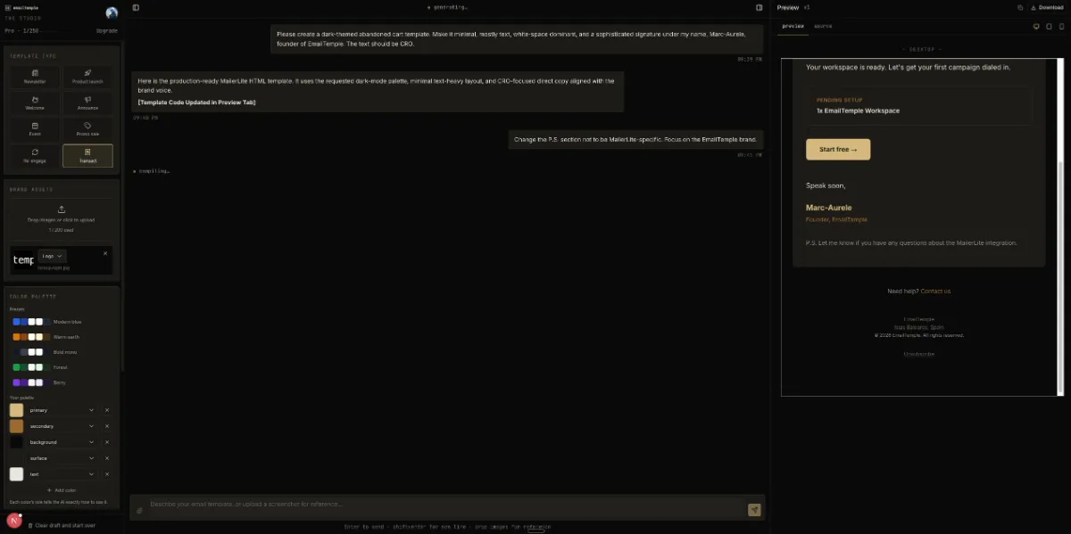
This is the exact gap a dedicated studio closes: describe the email you want to send, and get back a production-ready template that already carries your brand kit, your palette, your fonts, and your legal footer, without a fresh round of copy-paste for every new send.
It exports straight to your ESP in seconds, dark-mode-safe and already checked, so the review step is a glance, not a rebuild. When you need more than one email, generate a whole lifecycle flow from a single brief and export it ready for your ESP.
Generate your branded template for free.
Frequently Asked Questions
What is the best prompt structure for a marketing email?
The most reliable structure has four parts: a role for the model to play, the context it needs, the goal of the email, and constraints on length, tone, and format.
For chatgpt email prompts specifically, that means a system prompt defining the model as an email architect, brand context describing your colors and voice, a clear campaign goal, and explicit output constraints like table-based HTML and no exclamation points.
Installing the role and constraints once in a Project’s persistent instructions means every new campaign prompt only has to supply the context and goal.
Do these ChatGPT email prompts work with Claude and Gemini?
Yes, the four-part pattern (role, context, goal, constraints) is model-agnostic and works across ChatGPT, Claude, and Gemini alike.
What varies slightly is how literally each model follows tone constraints; if a draft from one model reads a little off, tighten the tone instruction rather than switching platforms.
The underlying rendering rules (table layout, inline CSS, VML buttons) apply regardless of which model generated the HTML, since the constraint is Outlook’s engine, not the model.
Why does ChatGPT HTML break in Outlook?
Outlook on Windows renders email with Microsoft Word’s layout engine instead of a browser engine, and that’s the root cause of most HTML failures.
Word’s engine doesn’t support border-radius, handles padding unpredictably across cells in the same row, and can’t reliably center content with modern CSS, so a template built with div-based, flexbox-style code collapses the moment it hits a Windows inbox.
The fix is table-based layout and VML button markup, which is exactly what a proper system prompt encodes before you ever describe a specific campaign.
How do I stop AI emails from looking generic?
Generic output comes from a generic brief, so the fix is feeding the model your actual brand specifics: real hex codes assigned to roles, your named heading and body fonts, and a tone-of-voice register instead of vague adjectives.
A first generation with those specifics in place will still need a second, targeted refinement pass to fix hierarchy, spacing, or dark-mode issues that a first draft rarely gets right on its own.
Generic output is a missing-brief problem, not a model-capability problem.
Can ChatGPT send the email for me?
No, ChatGPT and similar tools generate the template; your ESP is what actually sends it to your list.
The workflow ends with exportable HTML that you paste or upload into Mailchimp, ActiveCampaign, MailerLite, or any platform that accepts a custom HTML import, and the sending, scheduling, and deliverability infrastructure all live on that platform’s side, not inside the chat.
This split holds regardless of how good the generated template is.
How do I map placeholders to my ESP’s merge tags?
You find-and-replace each portable bracket placeholder for your ESP’s native merge-tag syntax before sending, since no ESP recognizes another platform’s tag format automatically.
[FIRST_NAME] becomes *|FNAME|* in Mailchimp, %FIRSTNAME% in ActiveCampaign, or {$name} in MailerLite, and the same swap applies to the unsubscribe link token.
Doing this swap once per template, right before import, is faster and safer than trying to get the model to guess your ESP’s syntax during generation.